Photo Processing Tutorial
This tutorial covers basic tips on taking and processing photos, with focus on the latter. It was created with beginners in mind, and should be useful even if you don’t have any experience with processing photos. It uses the GIMP – a multi-platform software available for free.
The following tutorial aims at transforming your photos into professionally looking images using free software only. It covers basic tips on taking and processing photos, with focus on the latter. It should be considered basic/pre-intermediate level: a person with a good knowledge on graphic programs will learn little; a complete beginner should be able to master all of the tasks listed earlier. My goal was to make it useful to readers who have never worked on their photos in any graphic program, therefore it requires no knowledge on such programs and it consists of simple, extensively explained steps.
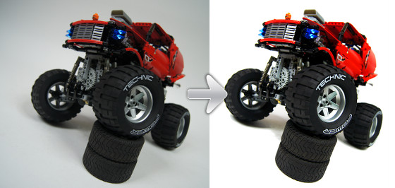
The tutorial makes use of the GIMP (GNU Image Manipulation Program): a free image manipulation software available for Windows, Mac OS and Linux at no charge. There are several reasons for choosing that particular software, and they are discussed in section 2, along with the installation & configuration instruction. Please note that the GIMP is in fact quite a powerful tool, in some areas almost as powerful as the Adobe Photoshop, and we will be using only a small fraction of its abilities. These abilities, however, are sufficient to make a transformation just as the one shown in this tutorial’s opening picture, and I hope that once mastered, they can become your basis for further experiments.
The GIMP 2.6.11 was used for this tutorial.
Please note that all the images in this tutorial are thumbnails that open up at full size upon clicking, and they should be viewed at full size.
Finally, note that some parts of text in the tutorial are marked with bold font. These are instructions for actions we will be using often.
Contents:
- Taking the photo
- The GIMP
- Cropping and resizing
- Color manipulation and clearing the background
- Saving
1. Taking the photo
Photography is a vast subject itself, so I will only put a couple of tips here. How your photos will turn out depends basically on two things: what you take them with and how.
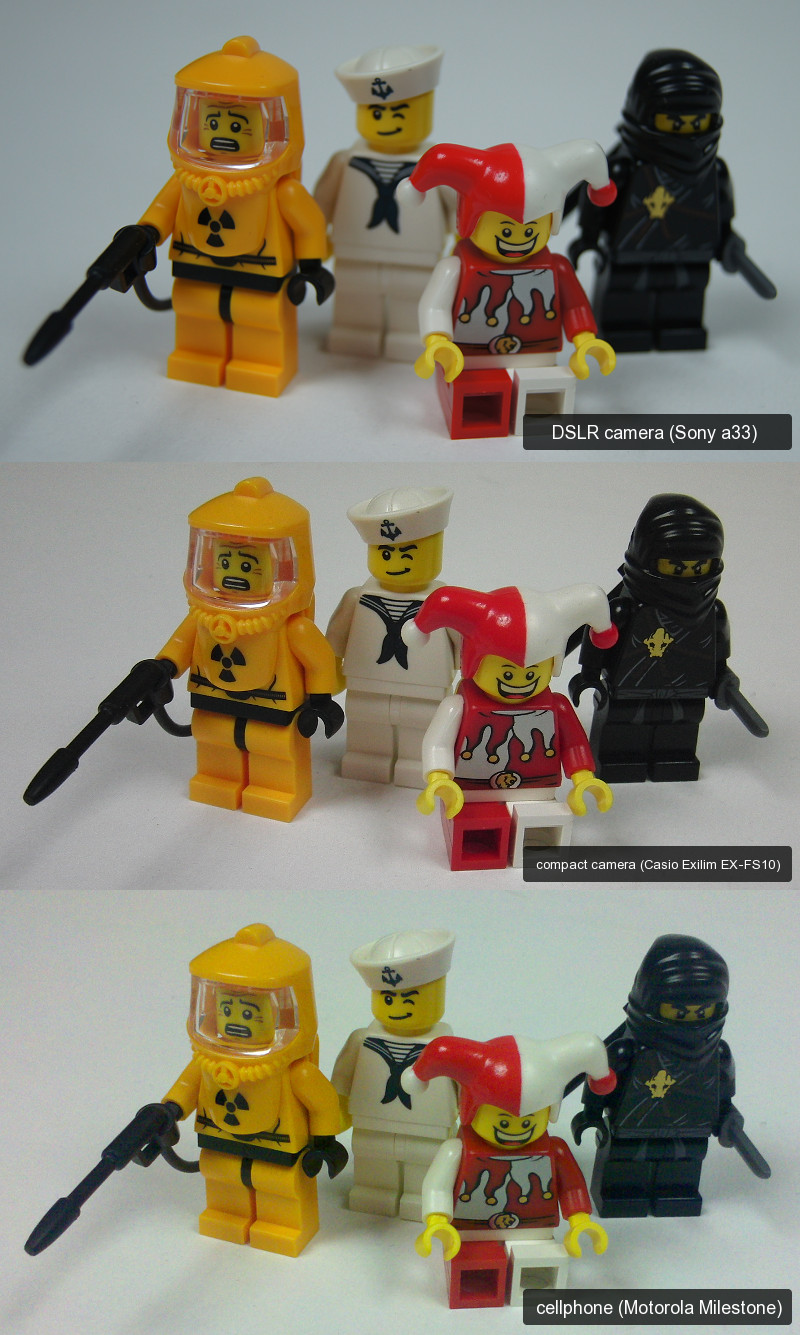
Camera! Good cameras produce good photos. Choosing the right camera for the job is tricky, especially since the cameras market is changing quickly. However, the rule of the thumb remains the same: the more you pay, the better results you can expect. That doesn’t obviously mean that you should get some very expensive, professional camera just to take photos of a handful of Lego bricks. It means that you shouldn’t expect too much if you decide to take photos with your cellphone. Take a look at this comparison – you can clearly see as the colours get worse and the noise gets more intense with worse cameras:
Backdrop! Try to take photos of your construction with plain white material behind, and preferably also below it. It will make your photo brighter, cleaner and it will even decrease its weight. Your construction won’t get much attention if there’s a pile of clothes and half of your desk next to it on the photo; but by using background you can easily make it the only object on the photo. Additionally, as the white surfaces reflect light, your construction will appear well-lit.A very good solution for a backdrop is a large sheet of plain white paper folded to cover both the background and the ‘floor’ of your photo. Personally, I’m using 10 x 2 meters paper roll which works extraordinarily well, but small constructions don’t need anything that big. For example, when taking photos of a couple of minifigs, you should be able to do the job with a couple of paper sheets. A regular sheet from your bed is also an option, but it won’t work as well as paper because it’s not that smooth (the texture of the fabric can be visible on the photo), and it’s harder to keep it perfectly flat.
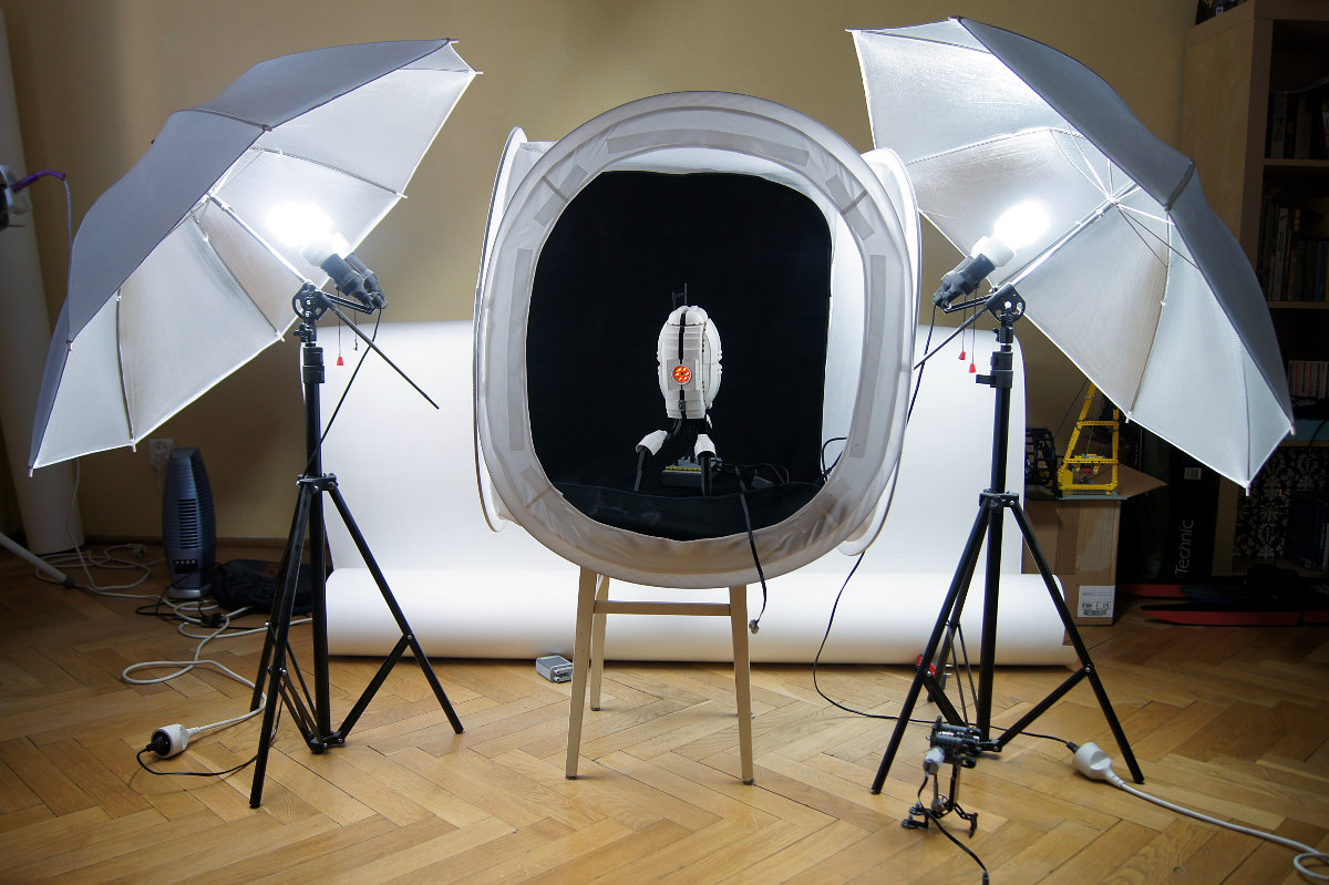
Lighting! A perfect solution is to use a light tent which diffuses light and makes it appear to come from all directions without one particular source. The light tents are not exactly part of a regular household and we will not discuss them here, but if you’re interested, this is what a light tent in use looks like:
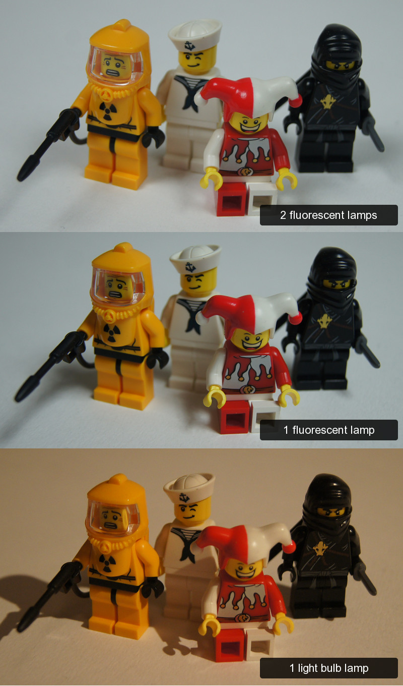
If we don’t exactly want to foray into light tent extravaganza, we should be able to lit our object properly with two lamps, preferably identical ones. One lamp is a bad choice as it will create large, shaded areas even if placed very close to your camera. Two various lamps are bad choice too, as one of them will be stronger than the other. With two identical lamps, the shades one lamp created will be nearly cancelled out by the other. Take a look at this comparison:
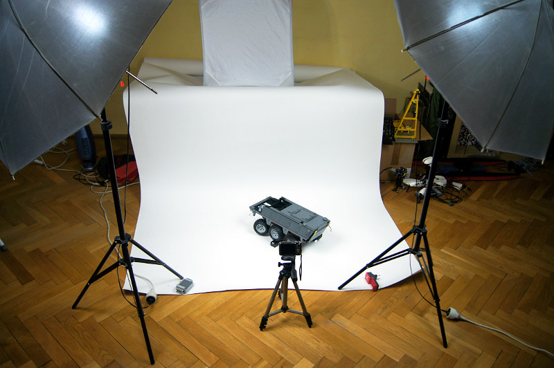
Once you have two identical lamps, you should place them on two opposite sides of your construction, slightly between it and the camera, facing towards the construction. Look at a watch: if we assume that the camera is where the hour 6 is and the construction we’re taking photos of is in the middle of the watch, then lamps should be placed at hours 4 and 8. This is what my “photo set-up” usually looks like:
Choosing the right lamps is important as well. It’s best if your lamps provide bright white (not yellowish) light and if their height can be easily adjusted. There is a wide choice of special studio lamps that can do that, but you don’t have to look that far: a good quality desk lamps with something else than a classic old-type light bulb (preferably a modern fluorescent lamp) can give surprisingly good results. As for me, I’m using a pair of studio lamps with Philips Tornado 23W fluorescent lamps, which are energy-saving and provide daylight-like light, and the lamps themselves can be folded and transported easily, their height is adjustable within an impressive range, and they have reflective umbrellas that help to use the light more efficiently. Their only disadvantage is the heat they create.
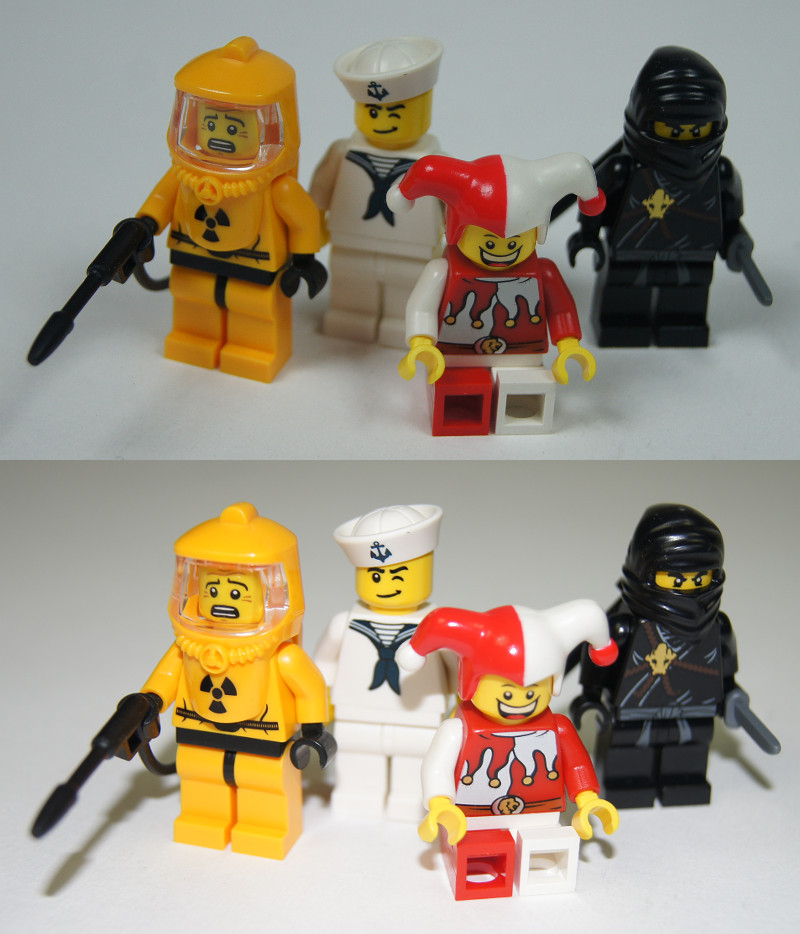
Many modern cameras come with built-in flash lamps. One advice: don’t use flash. Lego pieces are quite glossy, and the vast majority of the built-in flash lamps is too weak to produce good effects. Additionally, most of the modern cameras can adapt to normal stand-alone lamps much easier than they can to a flash lamp. Don’t take my word for it – take a look:
As you see, the lower photo, taken with a flash, can initially impress with vivid colour. But if you look closer, you will notice that the objects close to the camera are too bright (e.g. jester’s legs), the objects far from camera are too dark (the backdrop) and that the colours look wrong (it’s hard to tell the yellow face of the first minifig on the left from his orange suit).
Finally, make sure your camera is set to save photo files in highest standard possible. High-end cameras can save photos in JPG + RAW format – this will be redundant for us. The JPG format set for top quality/lowest compression will be enough. We will get back to the JPG format in section 5.
2. The GIMP
As mentioned earlier, we will be using the GIMP (GNU Image Manipulation Program) software. It is a free image manipulation tool available for many platforms in many languages and it offers majority of the Adobe Photoshop’s abilities at no charge. The GIMP can be downloaded from here.
Why GIMP? First: it’s 100% free. While the Adobe Photoshop is the unquestionable leader among 2D image manipulation programs, it’s expensive and there are plenty of tutorials already available for it. Second: it’s available for all major platforms, in most major languages. Finally, it supports the Photoshop file format – it can read and create PSD files, although it omits certain data (such as editable text).
The following tutorial will be using the GIMP 2.6.11 in English version, and it is recommended to install this or newer version. Versions in other languages should only differ with text; newer versions should differ little. There have been no dramatic changes in GIMP’s development over the past few years, and if such changes occur in the future, I will do my best to update the tutorial.
Once you download the GIMP, the installation is really straightforward. There is a very good help section at the GIMP website to which you can refer.
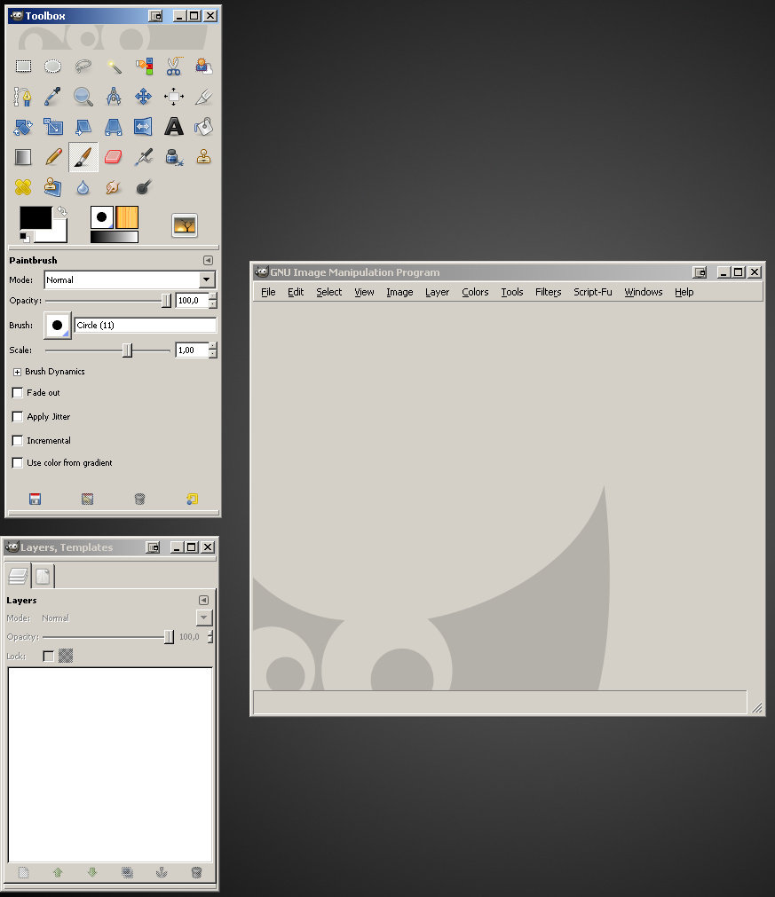
When launched for the first time, the GIMP will take a while to start. This is normal and only takes place once. Once started, the GIMP should look like this:
As you see, there are three windows here: the toolbox (upper left), the dock (lower left) and the main window (right). This is the default configuration and we will now change it for our convenience.
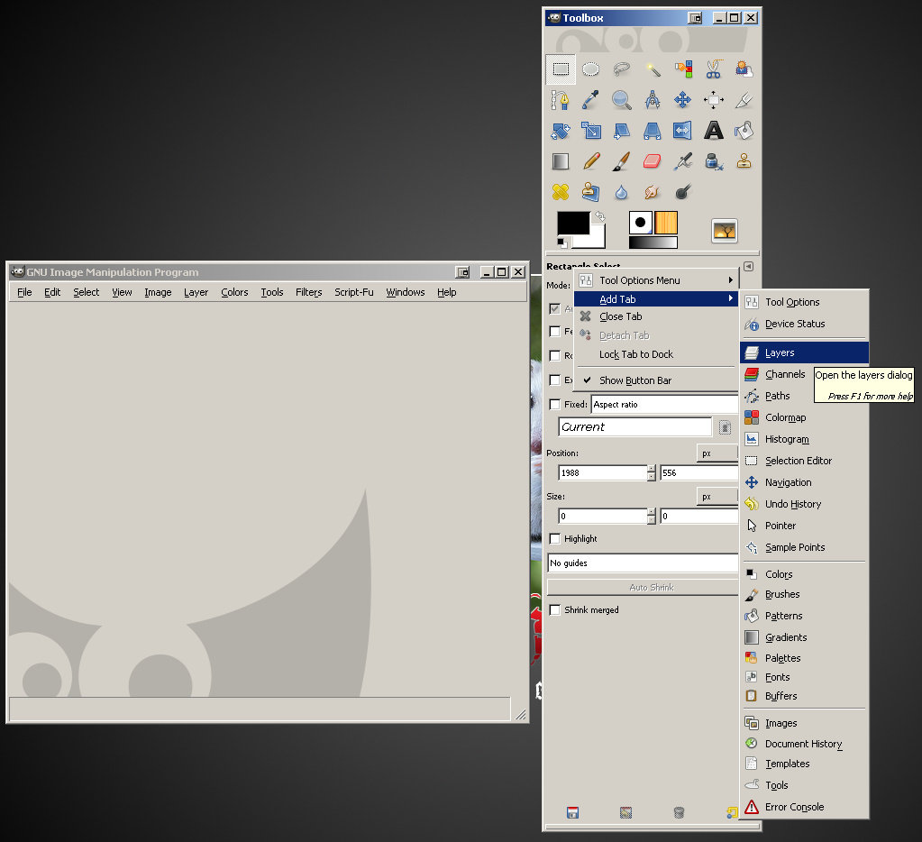
First, let’s close the dock using the X icon in its upper right corner, just like with any regular window. Now, you can see that the toolbox window consists of two parts: upper with icons and the lower starting with “Paintbrush”, separated by horizontal line. The lower part will be our new, handy dock. In its upper right corner, there is a small icon with a triangle inside a square. Once you click it, a menu will open up. When you select “Add Tab” from it, it should look like this (note that I moved the toolbox to the right, but this is just my personal preference):
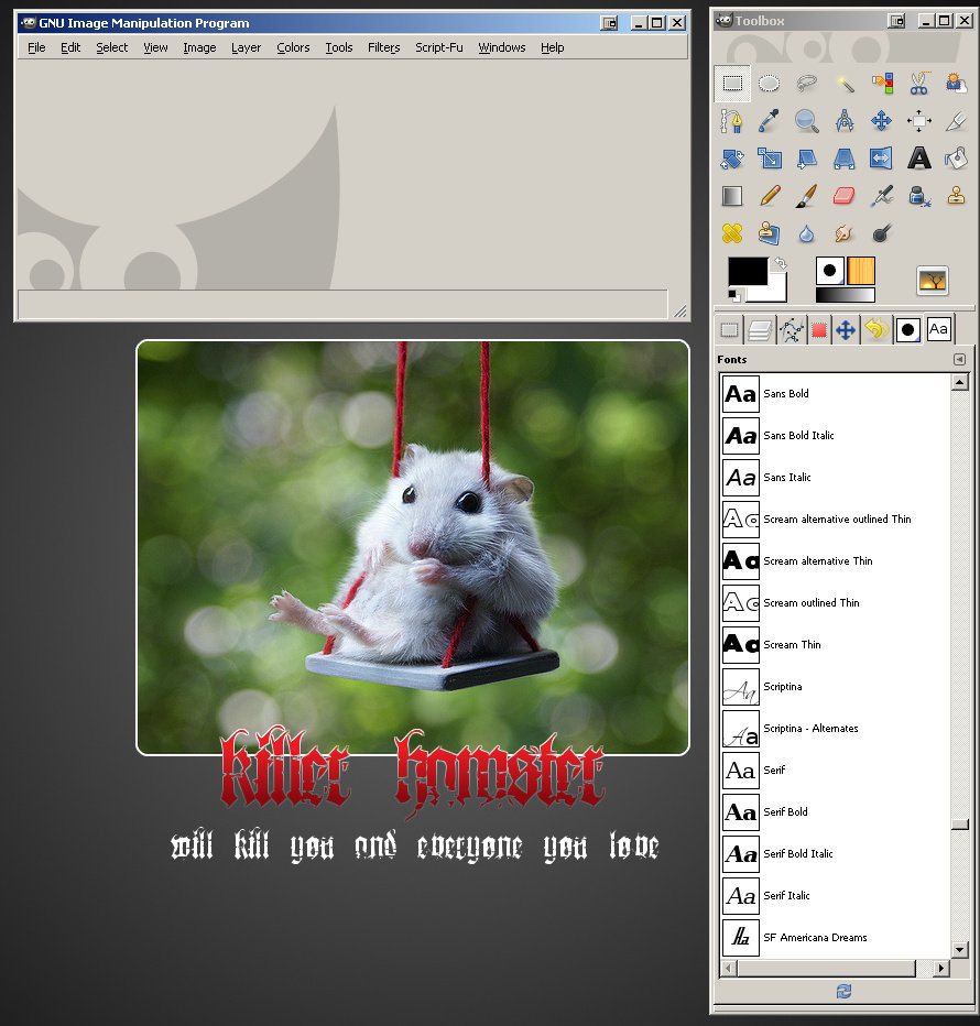
Select “Layers” from the long menu that opened up. Then, in the same way, select “Add Tab” > “Undo History” and then “Add Tab” > “Fonts”. Your GIMP should now look like this, except that I have added more tabs to my dock (they are shown as the row of square icons below the horizontal line that separates dock from the toolbox). Also in this picture: my wallpaper. Don’t let it disturb you 🙂
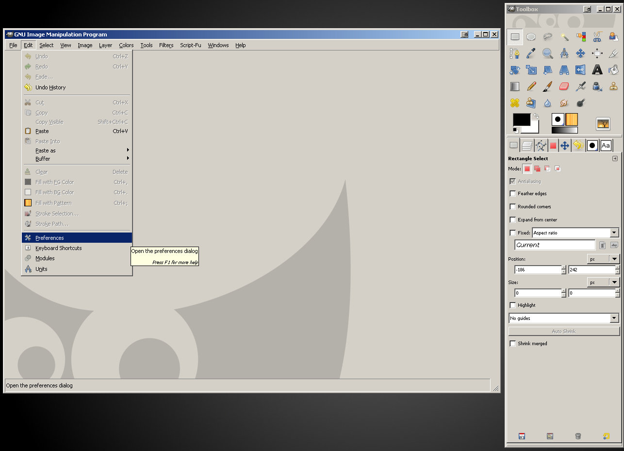
Finally, let’s make things even more convenient by tweaking the preferences of our GIMP. Take a look at the main window: it has a horizontal menu at its upper edge. If you click “Edit”, a menu will open with “Preferences” available in it:
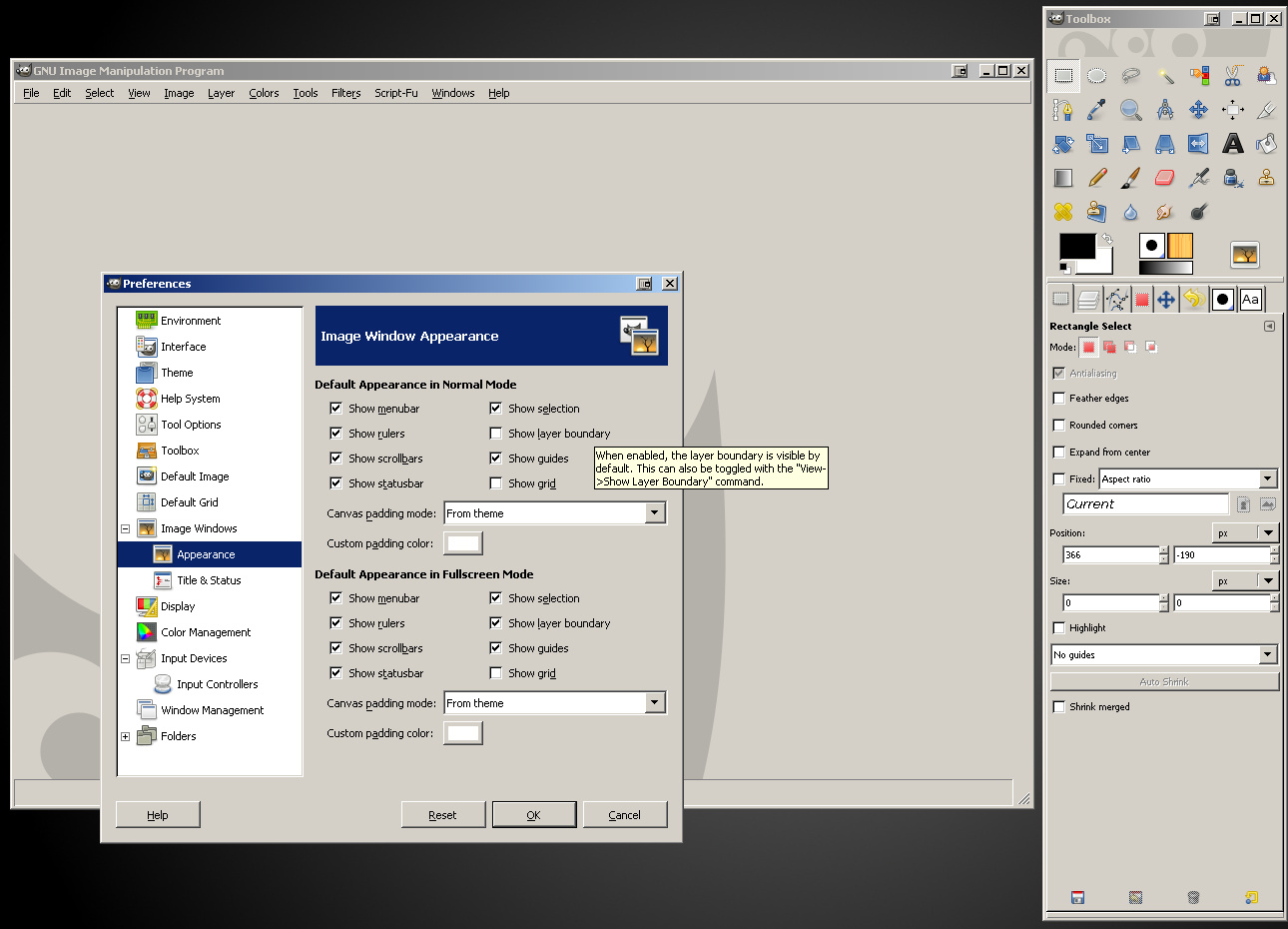
In the window that will open upon clicking “Preferences”, select “Appearance” from the list on the left. The “Image Window Appearance” tab will open. Find the “Show layer boundary” option which should be checked by default, and uncheck it. This will deal with the terrible eyesore border displayed around every single image opened in the GIMP. Confirm the change by clicking “OK” button near the lower edge of the “Preferences” window.
We are now ready to proceed with photo processing. If you want to make sure that GIMP has saved all the changes we’ve made to it so far, just close it (by closing the main window or the toolbox) and launch it again. Now it’s time to open up our first photo.
3. Cropping and resizing
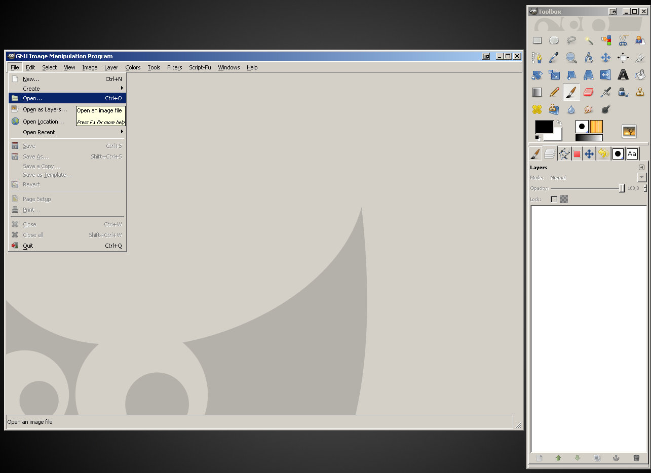
To open a photo, simply drag and drop it on the GIMP’s main window or toolbox. Alternatively, you can click “File” in the main window’s menu and select “Open…” if you like doing things the hard way 🙂
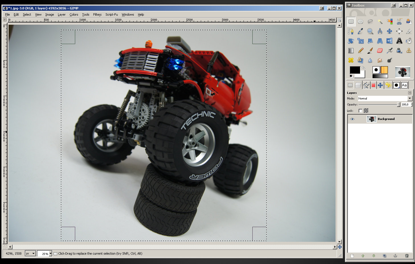
Once a photo is opened, the GIMP will automatically adjust zoom if the photo is larger than your screen. As you see, my photo which is 4592 x 3056 pixels big, was opened at 25% zoom. Also note that the GIMP shows the size of the photo on the main window’s title bar.
Now, there are two things we’re going to do with the photo: crop and resize. Cropping is simply reducing photo to the desired area only – for instance, the photo you see above has needless empty space on left and right. Resizing is a different thing, and – unlike cropping – pretty much mandatory one.
Every photo file has certain size measured in kilobytes (kB) and megabytes (MB): 1MB equals 1,024 kB. This size, which we will call weight to avoid mistaking it with the actual size of the photo (that is its width and height in pixels) is simply the amount of data that describes the content of the file. Since we’re going to publish our photo in the web, its weight should be as small as possible. Heavy photos take long to be viewed through the web, as plenty of data has to be transferred to the viewer.
There are several ways to make a photo weight less. We can reduce its quality and we can make the photo smaller – both will reduce the amount of data in our photo file. There is of course a certain limit to both: the photo that has very low quality or is very small will not be attractive to the viewer. Our goal will be to find a good balance between the quality, size and weight.
Publishing photos directly from the camera, in their original sizes, is a terribly bad idea – and one, sadly, still popular among less experienced builders. This is because modern cameras produce photos much larger than modern computer screens can display, and this difference is clearly only going to get bigger. The photo I have opened is 4592 pixels wide and 3056 pixels tall – it was taken at 14 megapixels, the largest size my camera can produce. My computer screen, on the other hand, has 1680 x 1050 resolution, which is fairly high by today’s standards, but it means it’s only 1680 pixels wide and 1050 pixels tall. It means the photo is almost three times bigger that my screen, and I will have to zoom it out to roughly 30% to see all of it on my screen. That, on another hand, means that I’m going to use only 30% of the data I have downloaded in order to view it. That should explain why people really don’t like viewing straight-from-camera photos.
Given the size of computer screens that are popular today, I think a 1200 pixels wide photo is large enough. The height can vary depending on the type and position (vertical/horizontal) of the camera that has taken that particular photo, but the 1200 pixels width will be used as a standard in this tutorial.
We discussed the size of the photo, and what about its weight? The original photo file taken straight from my camera weights 3.03 MB, that is over 3,000 kB. This is way too much, and much of it is actually redundant data. We are going to make this photo weight less than 200 kB (that’s over 15 times less) and look better at the same time.
There is also one more reason why people frown over not-resized photos: the server space. Whenever you upload a file to the web, it is saved on some web server where it takes some space. There is, of course, plenty of free server space to use, but that’s not a reason to upload photos that take over ten times more space than they need to. Reducing the size of our photos 15 times means we can store 15 photos taking the very same amount of space we needed to store one. That’s a good thing for everybody – for viewers who will not be forced to download redundant data to see your photo, and for you as you will need less time to upload your photos and you will need less space to store them – not only in the web, but also on your computer.
Let’s sum things up: we are going to crop and resize. Cropping is optional, resizing is mandatory. If we feel our photo needs cropping, e.g. because there’s a lot of useless blank space on it, it is recommended to crop it first and resize it later. Doing things in this order lets us control the size of the photo: cropping reduces the size, so if we resize the photo to our desired 1200 pixels and then crop it, the resulting file will be smaller than 1200 pixels.
Let’s assume we decided to crop our photo. We will do it by drawing a rectangle that covers the area of the photo we want to keep and then we will remove everything else.
Select the Rectangle Select Tool from your toolbox (shortcut key: R) – it’s the very first icon. Now, simply draw a rectangle on the photo starting with the upper left corner and ending with the lower right corner. To draw, left-click your mouse on the photo and drag it while holding the left mouse button. Let it go when you’ve reached the point where your rectangle’s lower right corner should be. If you’re unhappy with your rectangle, simply undo it (press “Edit” in the main window’s menu and select “Undo” or use Ctr + Z keys combination) and start over. You should get something like this:
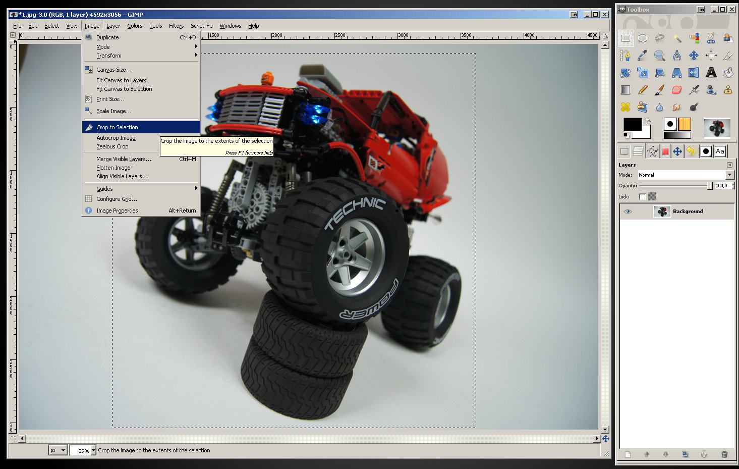
Now, the rectangle represents what we want to keep in the photo, and everything beyond the rectangle is what we want to remove. Go to the main window’s menu, click “Image” and select “Crop to Selection”.
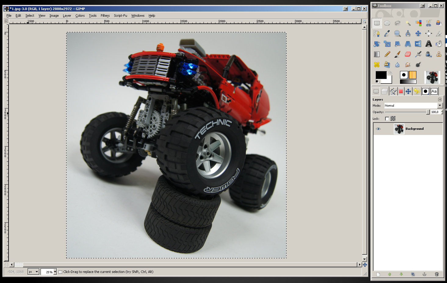
The result should look like this:
As you can see, our selection in form of the dashed line rectangle is still active. Let’s get rid of it: to remove a selection click “Select” in the main window’s menu and select “None”, or simply click (with your Rectangle Select Tool active) outside the selection (that means outside the photo in this case).
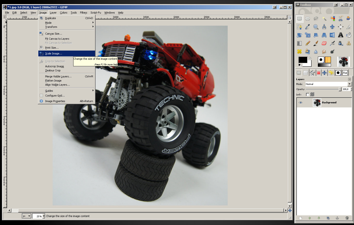
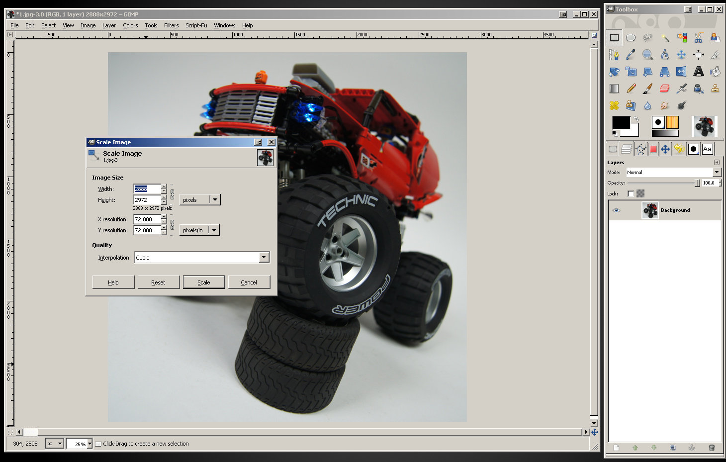
Congratulations – you have successfully cropped your photo. Let’s resize it now. Click “Image” in the main window’s menu and select “Scale Image…”.
A new window will open, with a couple of fields. We’re interested in only one: width. As you see, the width of my cropped photo is 2888 pixels.
Let’s delete 2888 and type 1200 instead, then confirm with the “Scale” button. Our photo has been resized: the GIMP’s main window still maintains its size, but the photo takes less space inside it, as the zoom is maintained too. We can zoom in to see it better. Tip: for easy zooming, hold down the Ctrl key and use your mouse wheel.
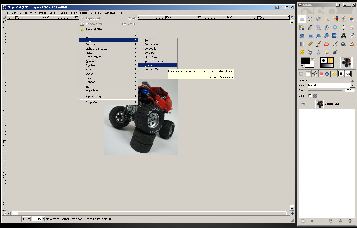
Now that our photo has been resized to smaller size, it has lost some sharpness. Let’s sharpen it up. Click “Filters” in the main window’s menu and select “Enhance” and then “Sharpen…”.
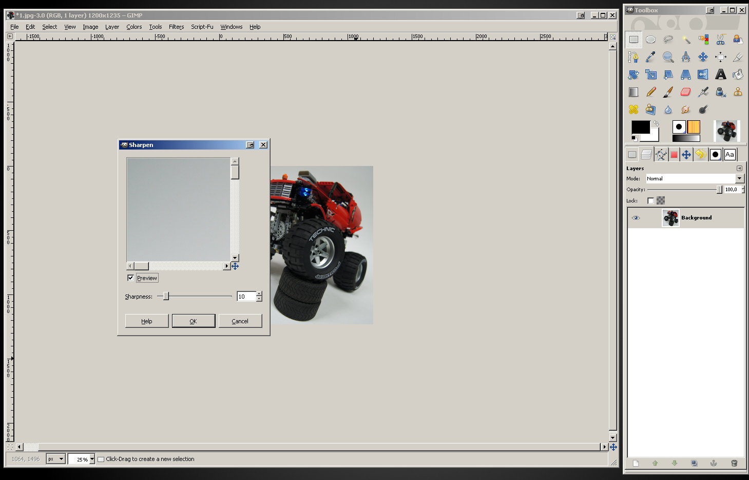
A new window will open, this time a very simple one. We need to set sharpness in it, using a slider. We can also use preview to see the result before we apply it, but just like with the rectangle selection, we can still undo sharpening after it has been applied and start over.
The exact sharpness needed depends largely on the camera we used. From my experience, the values between 13 and 18 are optimal in the vast majority of cases. Feel free to experiment with this setting, but keep in mind that it’s easy to over-sharpen a photo. Consider these examples:
You see three examples of the same photo after it has been resized to smaller size. Note that the difference between the first two examples: one not sharpened and one sharpened by 18 points, is barely visible, it can be actually unnoticeable for many viewers. That’s how sharpening should be used. The third example, with sharpness set to 90, is very sharp but didn’t turn out too nice.
This concludes the subject of cropping and resizing. We will now proceed with…
4. Color manipulation and clearing the background
Our photo is now cropped and resized. Time to clean up the colors on it. What we are going to do is to boost contrast, brightness and saturation of colors in the photo. Every camera, no matter how advanced, produces colors that can be manipulated to get a better effect. The final effect is obviously best with better cameras, but there is always some improvement possible.
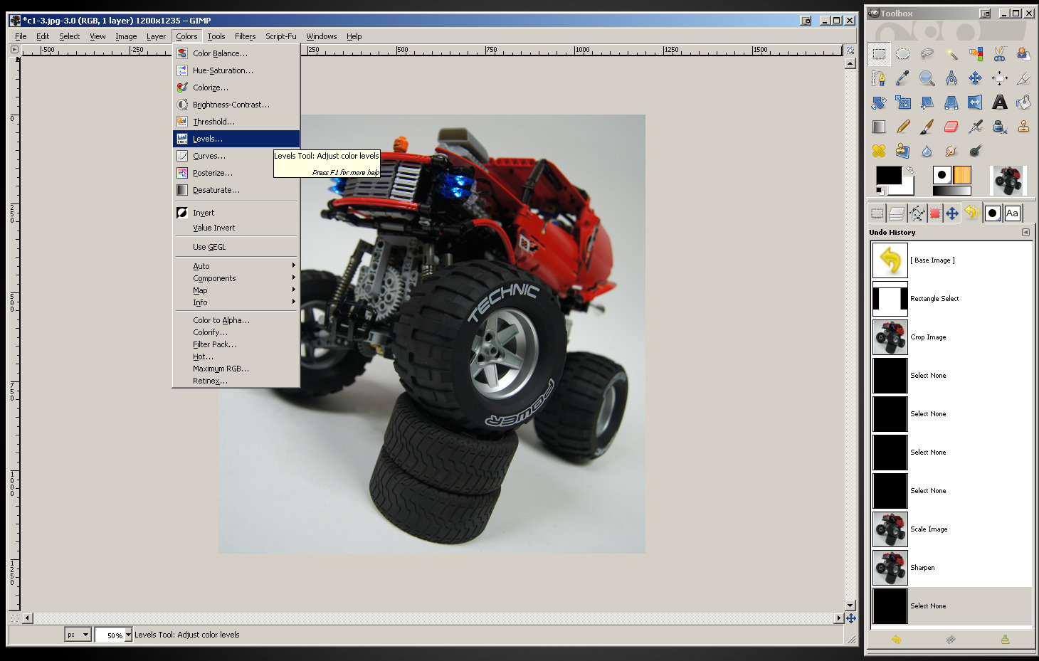
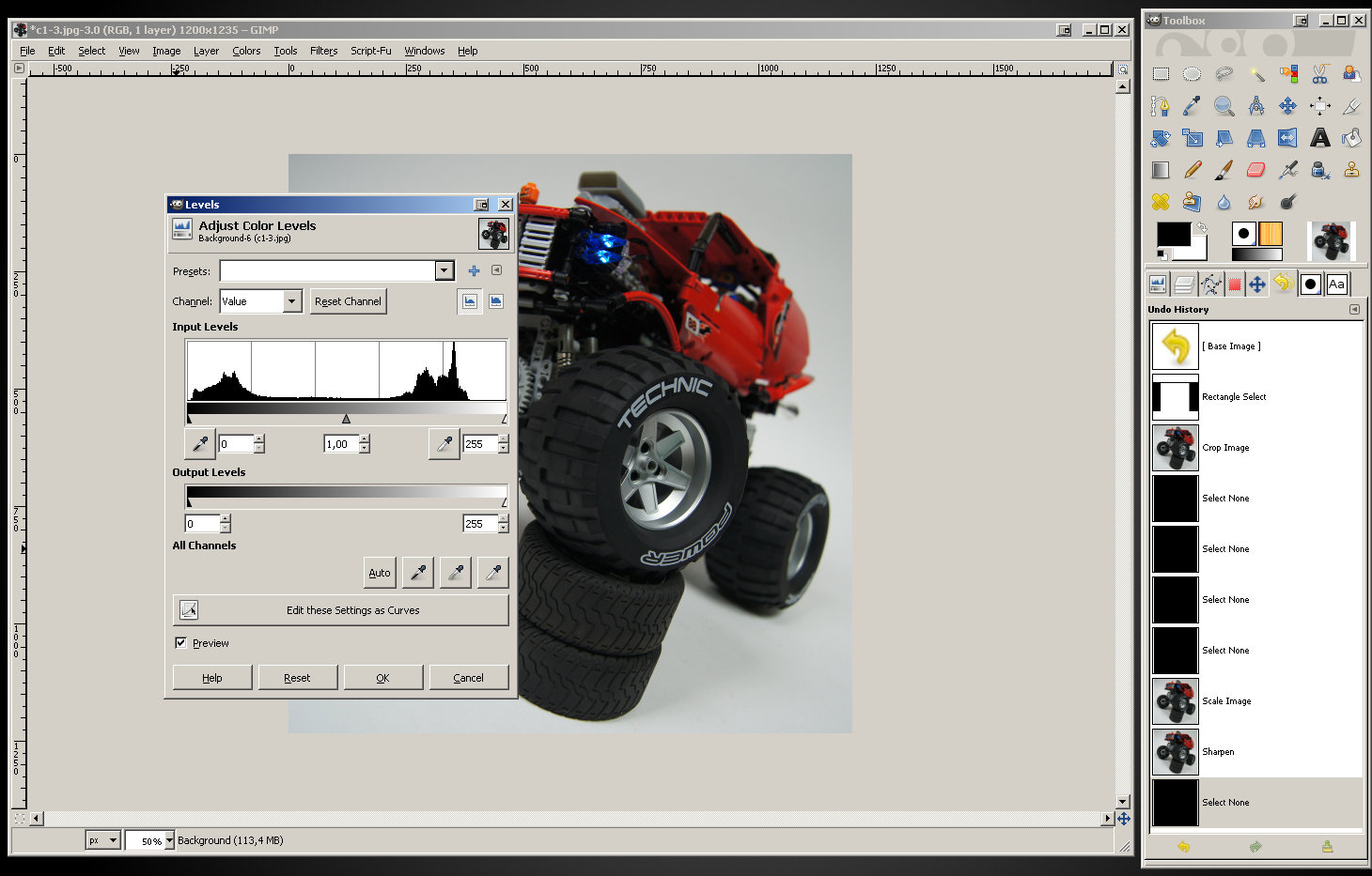
Click “Colors” in the main window’s menu and select “Levels…”.
A new window will open – it looks complex, but fear not, we’re only here to click two buttons: “Auto” and then “Edit these Settings as Curves”.
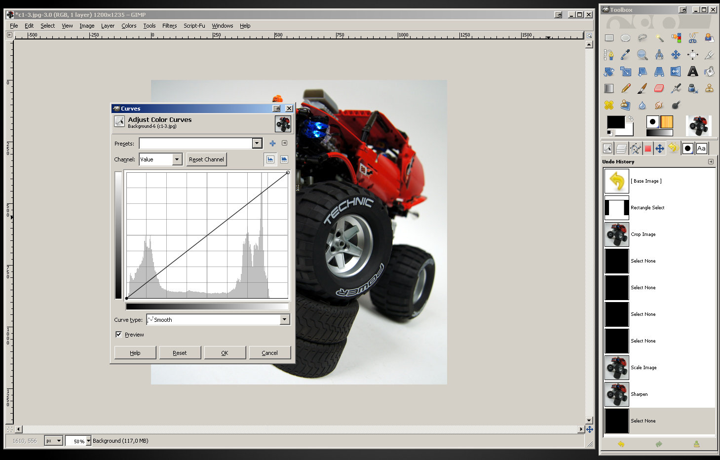
After you click “Auto”, colors of your photo will get slightly cleaner. This is exactly what we want, and after you click “Edit these Settings as Curves” the Levels window will close and the Curves window will open.
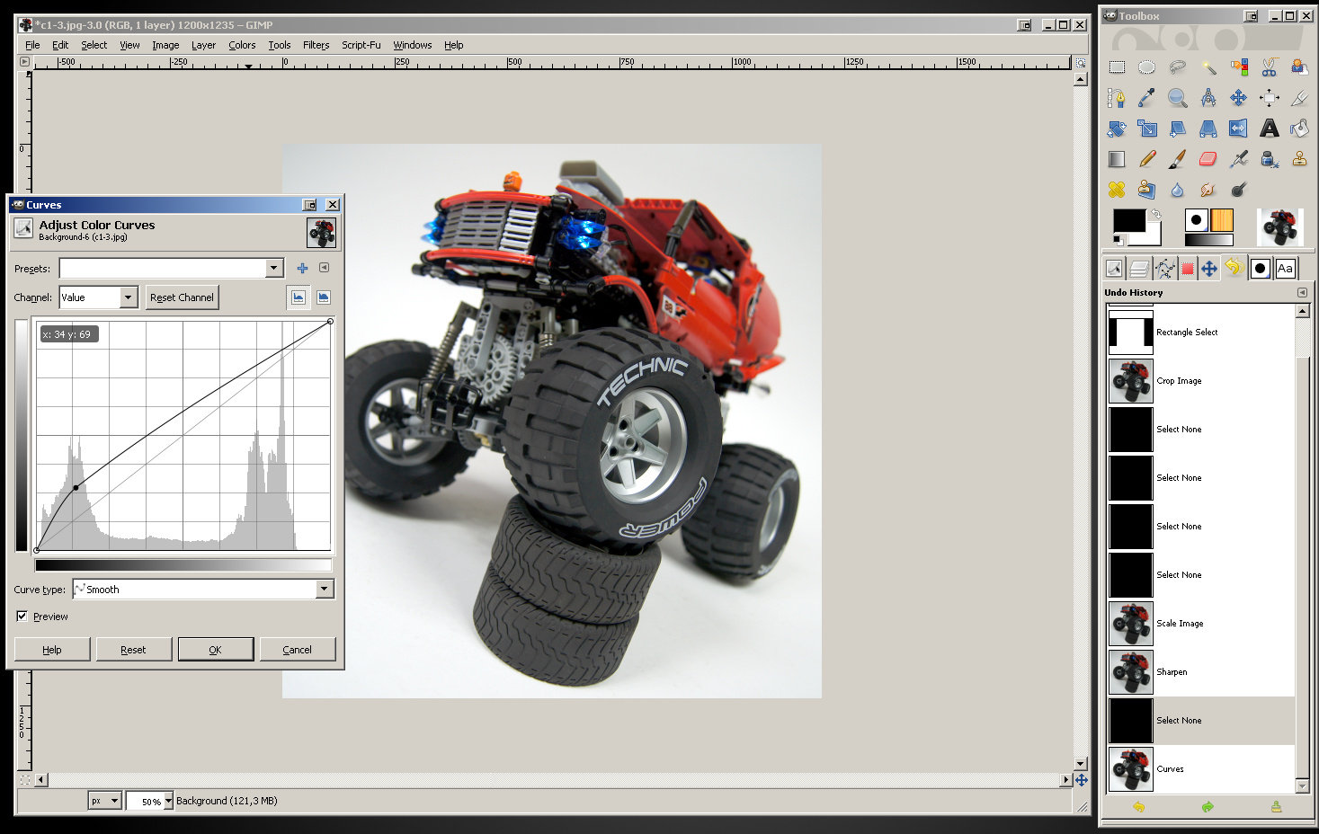
Now, look at the graph in the Curves window. It controls colors of your photo. The basic rule is: the left side of the graph represents dark tones, the right side represents bright tones. We can click on the line on the graph and drag it. If we drag it up, the respective tones get brighter and cleaner, if we drag it down the respective tones get darker and dirtier. Try dragging the left part of the line up and see what happens:
As you see, the dark areas of the photo – in this case the tires – got much brighter and cleaner. You can also notice that the line on the graph now has a curved shape and a dot right in the place where we dragged it. Time to drag up the right part of it and see what happens:
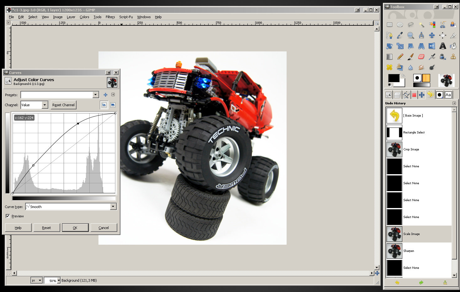
As you see, the bright areas of the photo got brighter and cleaner too. The right part of the graph line has particularly huge impact on the background – you can see that it changed to almost pure white on my photo. The line now has changed shape and two dots: one black and one blank. The black one is the one that has been dragged last. We can drag these dots around if we’re not happy with results, and we can add more of them by dragging the dot-less parts of the line. However, dragging it in two points: one on the left and one on the right – usually does the job. In my case, I’m pleased with the result of my two dots already, so I confirm the changes by clicking the “OK” button. Here’s what I got:
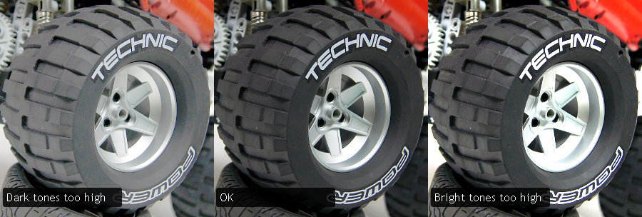
Note that just like with sharpening, it is important not to over-boost the colors. If dark tones are too high, the black will look like gray. If bright tones are too bright, colors such as light gray and silver will look like pure white. Take a look at these examples:
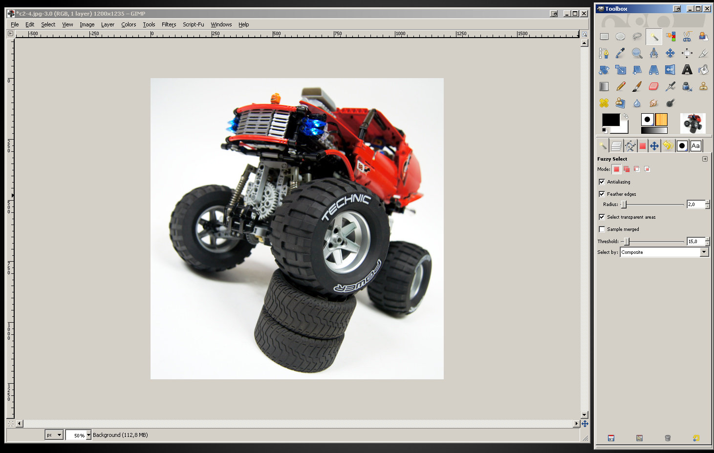
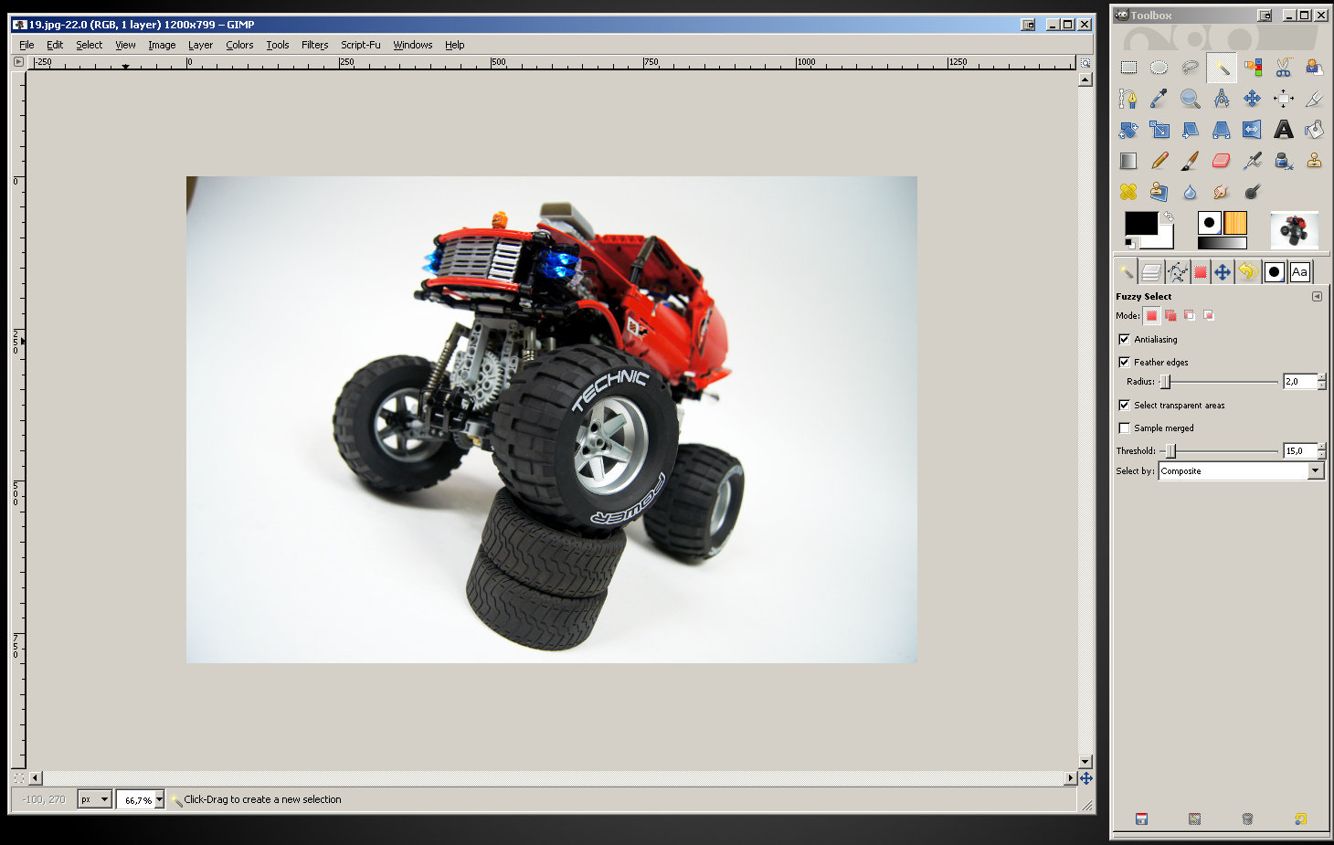
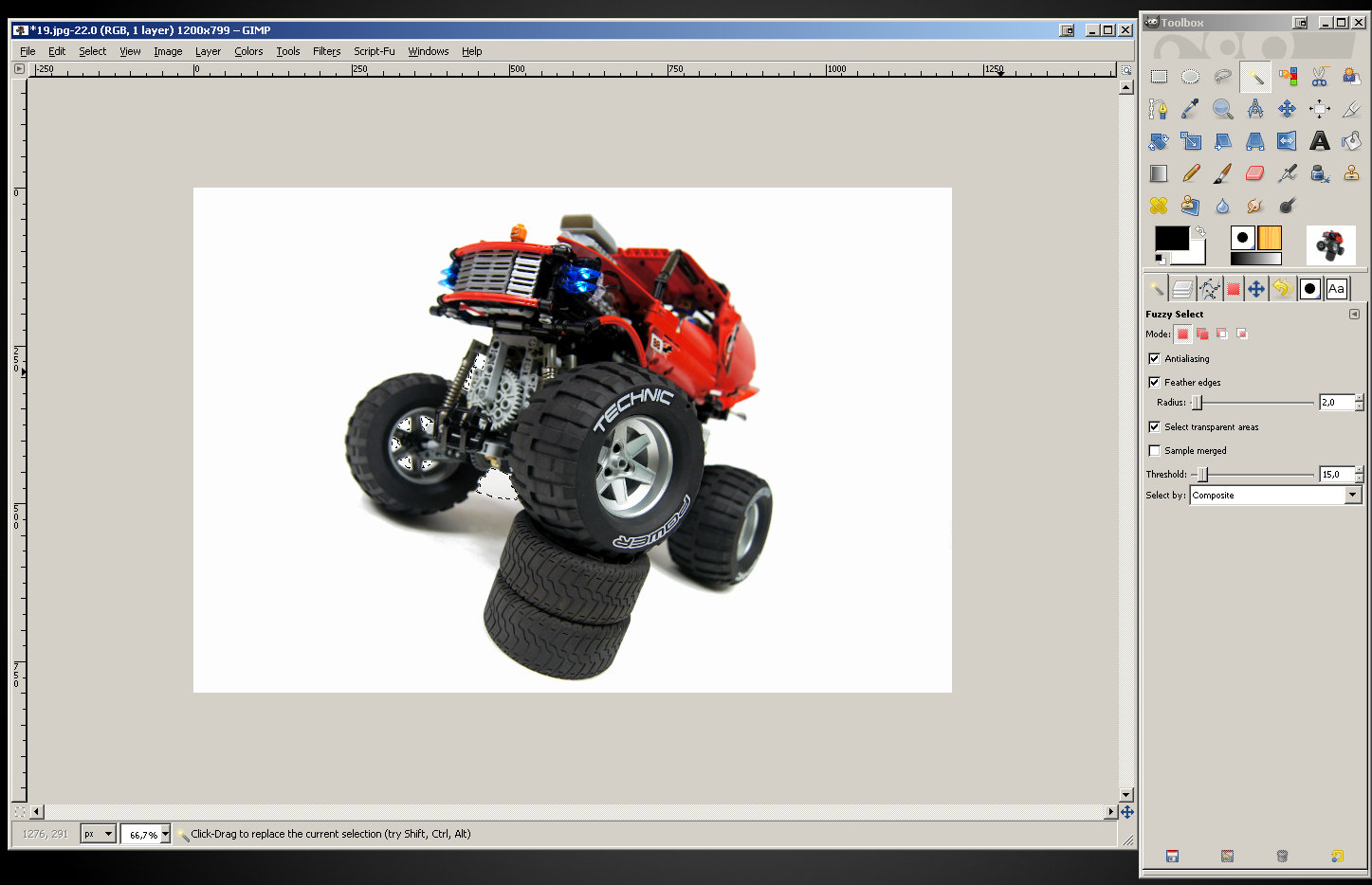
As you see, the background on my photo appears purely white now. But we are going to make sure it really is pure white. Select the Fuzzy Select Tool from the Toolbox (shortcut key: U). You will see options for this tool on the dock in the lower part of the Toolbox.
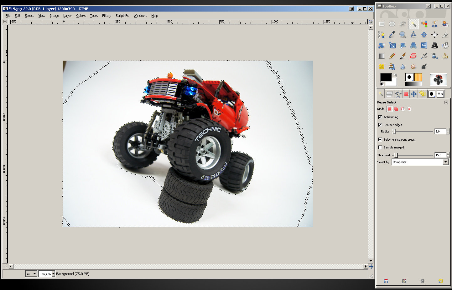
Check the “Feather edges” option – a slider will appear below it, with the default value 10. For our use, a value 2 or 3 will work best – let’s set the slider to it. Now, click somewhere on the photo’s background – not too close to the object on it and not too close to the edge of the photo. In this case, I have clicked a bit over my truck’s roof, in the upper right corner of the photo. A selection will appear:
We just selected the background. The Fuzzy Selection Tool selects the entire adjacent area of a given color – we clicked on white part of the background, so it selected everything that was white. The “Feather edges” option we checked makes sure that the edges of selection are a little blurred – it makes the cleaned background appear more natural than when they are sharp. Another interesting option of this tool is the “Threshold” slider: it controls the tolerance for variations in selected color. Basically, the higher threshold, the greater area gets selected because the tool selects colors of greater variety. With low threshold, you can click some e.g. bright red area and have a dark red area left unselected. With a threshold high enough, all red will be selected.
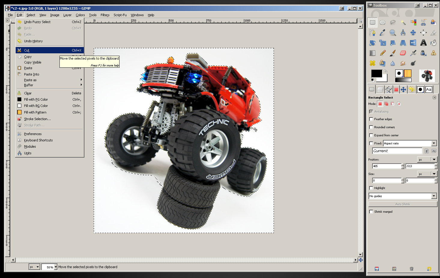
We are now going to cut the background from the photo – the GIMP will automatically replace whatever we cut with pure white color. Click “Edit” in the main window’s menu and select “Cut” or use Ctrl and X keys combination.
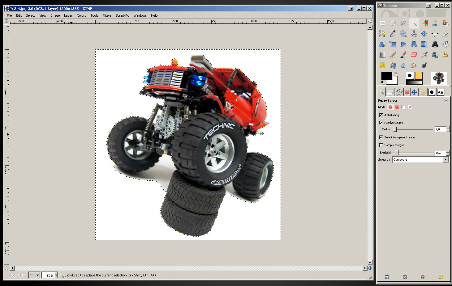
The result should look like this. It’s hard to tell the difference, but it’s there – the object on our photo appears well exposed now, because there is nothing that would distract us from it.
You can now remove the selection and enjoy your cleaned photo with boosted colors.
I was lucky because the Fuzzy Selection Tool selected my whole background, from the model to the edge – except for the model’s shadow, which we want to leave as it is because it looks natural. But when taking photos against any background, no matter how smooth and how well lit, it’s bound to appear darker near the photo’ corners. Let’s assume I haven’t cropped my photo before I started working on its colors – this is what it would look like after adjusting levels and curves:
You can see what I mean – the background clearly gets darker near the corners and side edges. I may not want to crop this photo, simply because I like the composition or because I need the space around the model for something. If I use the Fuzzy Selection Tool on the background, I will now get something like this:
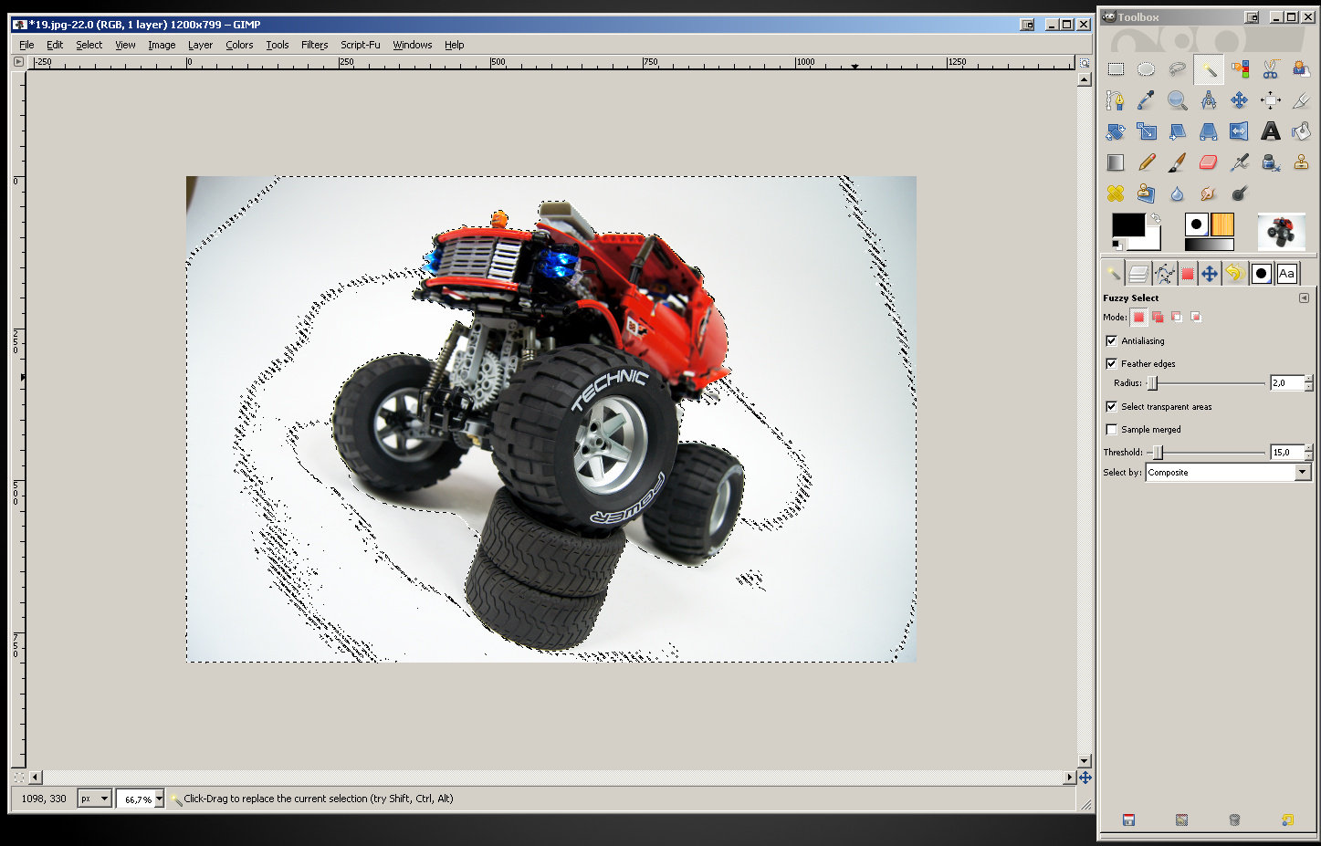
Note that it matters where you click – the Fuzzy Selection Tool takes the exact color you clicked as the desired one and it only selects colors that vary little from it. So, if you click very close to the model, where the background is very bright, the selection will be smaller. And when you click too far from the model, you can get something like this:
What happened here is: I clicked so far from the model that the Fuzzy Selection Tool created selection that is partially away from the model. There are areas on the sides of the model – smaller on right and larger on right – that are left unselected and they will look bad if we cut the background. We don’t want this – we want the selection to close around the model completely. Experiment with where you click and with the “Threshold” value until you get result close to the one from the previous image.
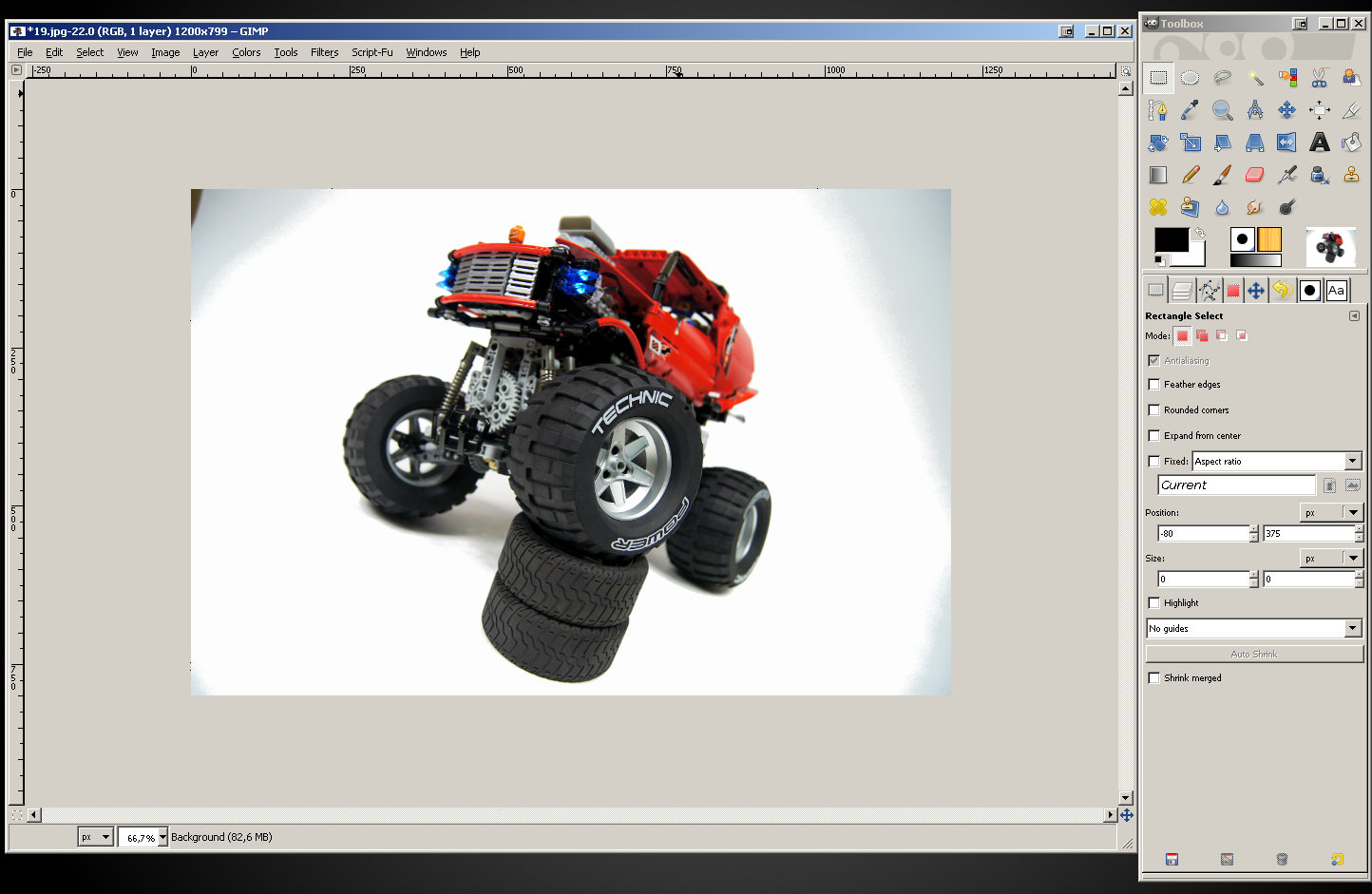
With the background properly selected, I cut it, remove the selection, and my photo looks like this:
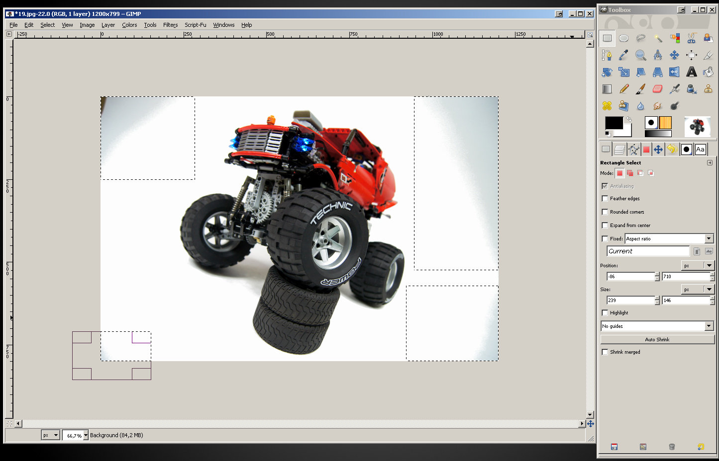
You can see what happened – the central part of the photo has background removed, but there are dark areas left uncut near the corners. We will now cut them manually using the Rectangle Select Tool – the one we have already used to crop the photo. Simply draw rectangles that cover the dark areas on the photo but not the model, and then cut them out. This image shows together the four separate rectangle selections I used to cut the corners one by one:
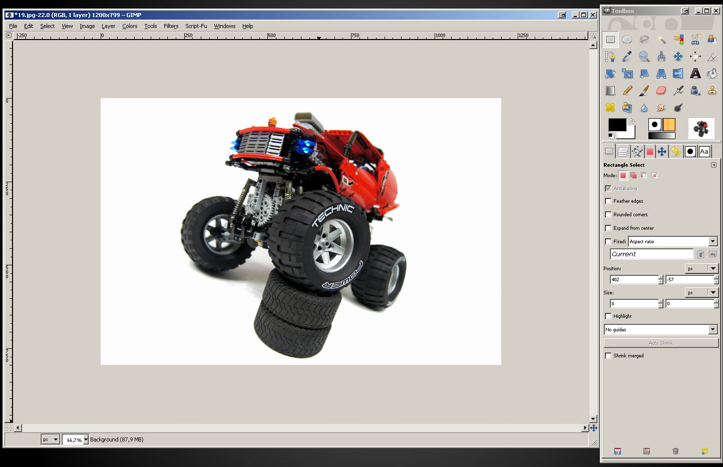
Once the last selection is cut, my photo looks like this:
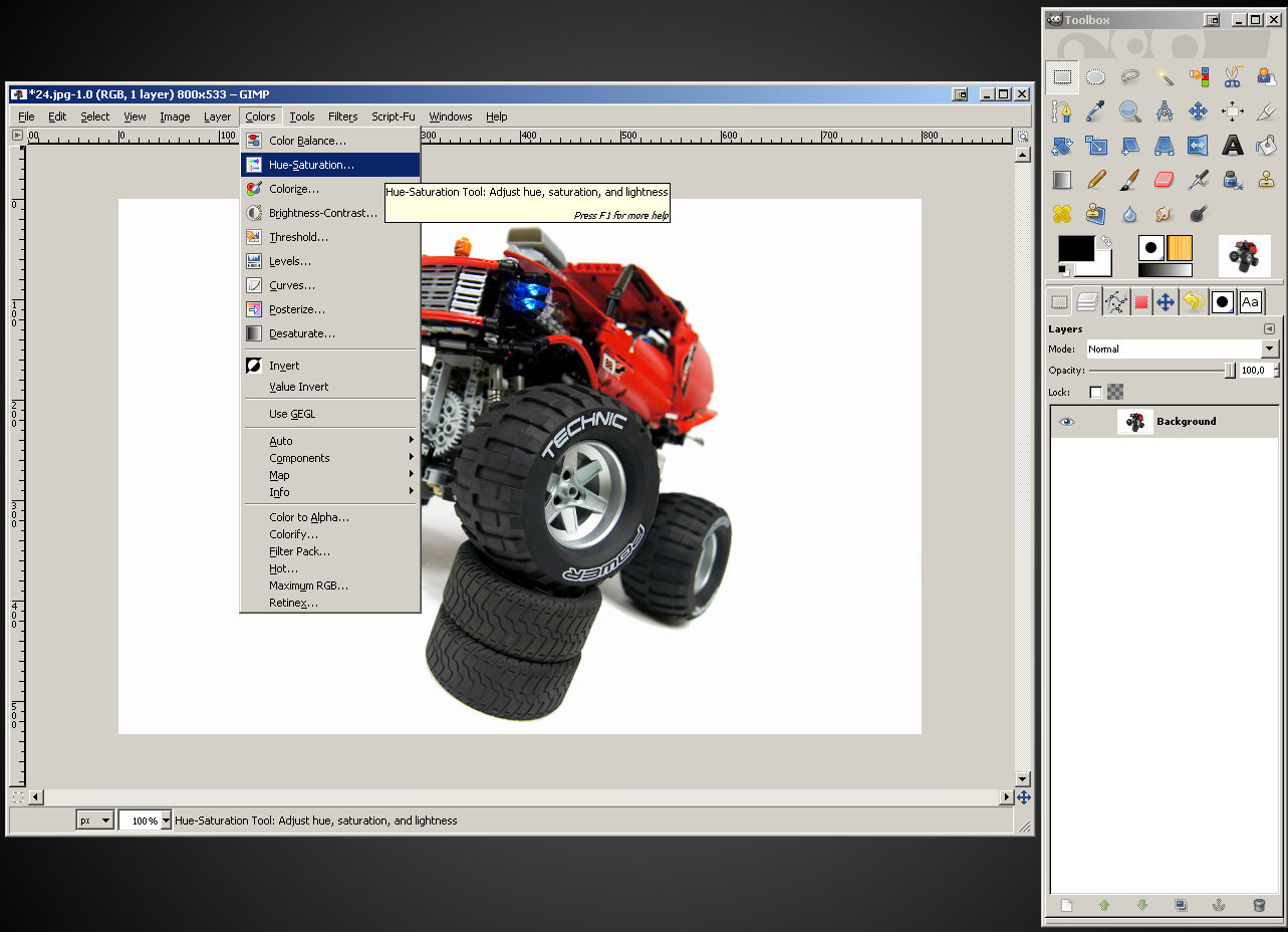
It looks very fine already, much better from what we started with. Let’s now take a moment and jack up the color saturation. Click “Colors” in the main window’s menu and select “Hue-Saturation…”.
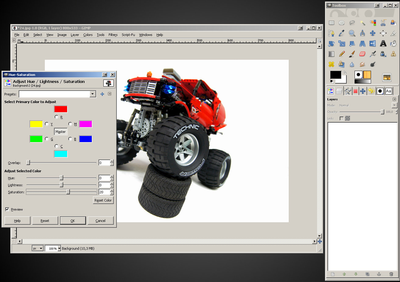
A new window will open, and just like with the Levels window – it looks complex, but we’re interested only in the “Saturation” slider.
If you move the slider to the right, the colors will get more vivid and juicy. If you move it to the left, they will become less intense to the point where they look almost like on a black&white color. When you’re happy with the result, confirm the change with the “OK” button. Consider this example:
Just like with sharpness, the saturation adjustment can be very useful but it’s easy to use it to excess. You should be sensitive to the difference between colors that are juicy and the colors that are screaming and neon-like. It is also important not to push it too far just because it looks good on our screen, because various screens display colors in various ways. Colors that look good on our screen can look unnatural and over-saturated on another.
Now, let’s get back to our photo with cleaned background. We have cleared the background around the object, but sometimes it still shows in other places. Take a look – I have selected these places here:
We can obviously select and cut these places one by one and get a clean white background. However, there are objects that can have tens of places like this, sometimes very small and scattered all around – for example a ship with its rigging. Cutting them one by one would take forever – and this is where we should use Select by Color Tool (shortcut key: Shift + O).
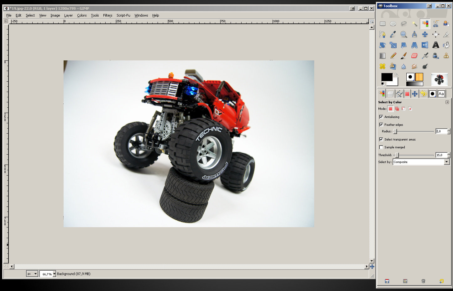
The Select by Color Tool works very much like the Fuzzy Select Tool, with one exception: it doesn’t select color just from the adjacent area. Instead, it selects color from the whole picture. If you click red, it will select all red, if you click white, it will select all white – depending on tolerance, which is set just like with the Fuzzy Select Tool.
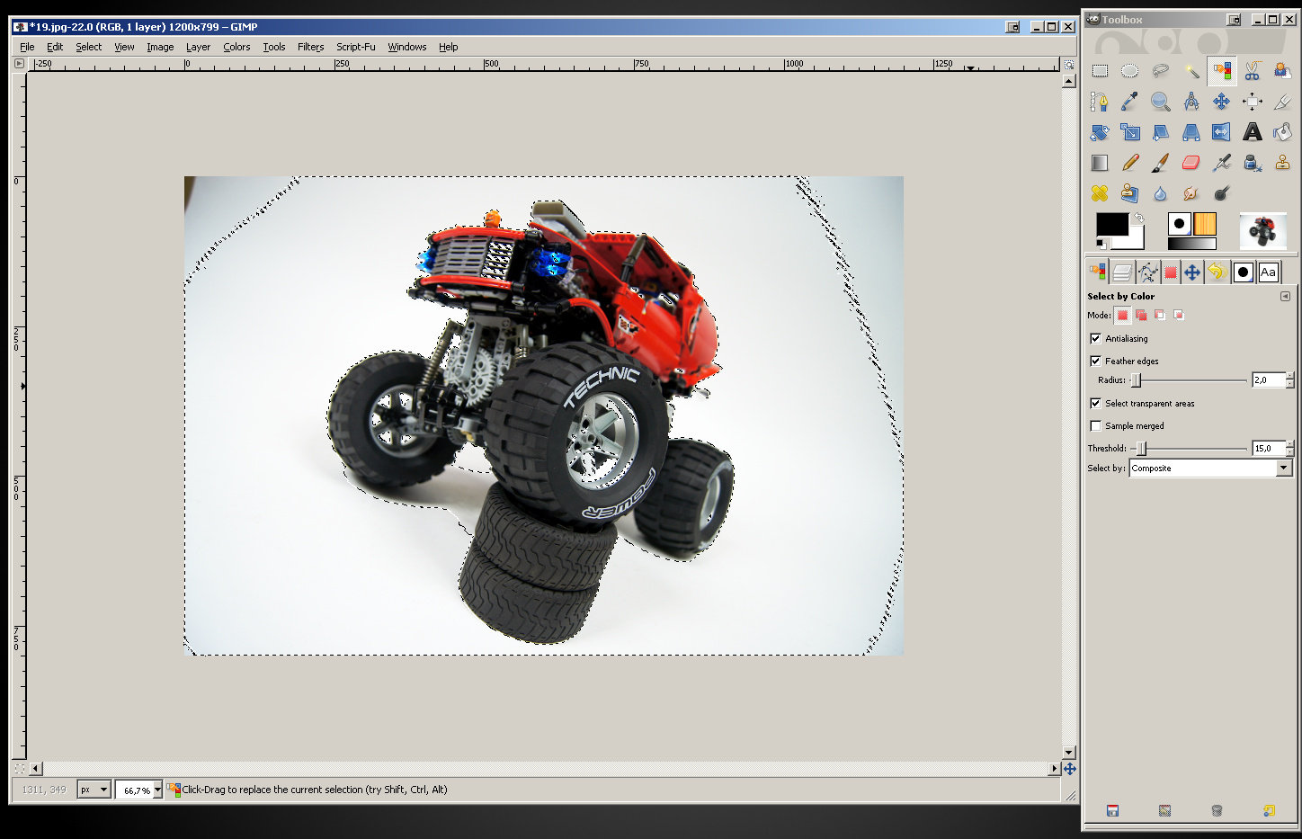
With the Select by Color Tool active, take a look at its settings. Just like with the Fuzzy Select Tool, make sure the “Feather edges” option is checked and set to 2 or 3, and keep in mind that you can experiment with the “Threshold” slider. Now, let’s click the background:
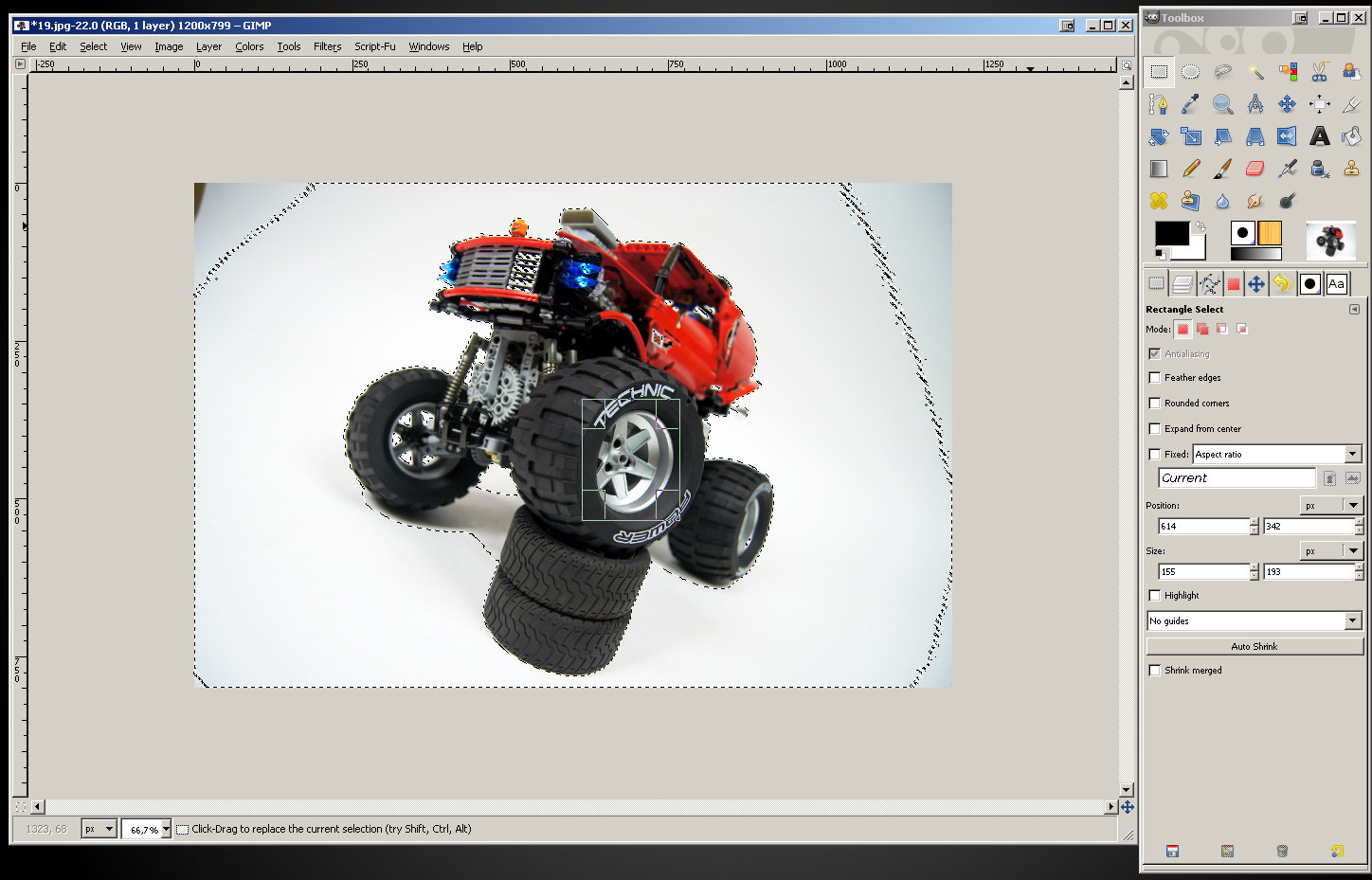
As you see, the Select by Color Tool has selected the background around the objects, the spots where the background shows through the object, but also some very bright areas of the object – in this case the grill and the wheel. Let’s say I was unable to find a setting of the “Threshold” slider that wouldn’t select these areas. So, I will do something different: I will subtract from this selection.
Select the Rectangle Select Tool and select the areas you want to subtract from the already existing selection holding your Ctrl key. Holding the Ctrl key causes the new selection to be subtracted from the previous one, so you can use it to de-select desired areas. In this case, I was able to easily de-select the wheel:
And then, the with another rectangle selection, I de-selected the grill:
Once all the desired areas are selected, I can cut out the remaining selection, which now includes only what I want to remove. After cutting and removing selection, this is what I got:
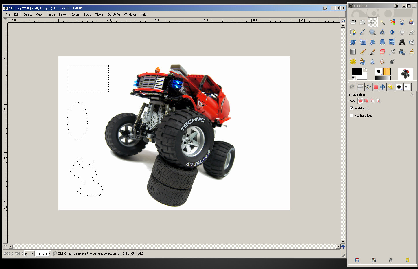
Keep in mind that you can subtract any kind of selection, not just the rectangle one. Ellipse Select Tool or Free Select Tool can be subtracted just as well, as long as you hold the Ctrl key while using it.
With the background of our photo cleared, we can finally proceed to…
5. Saving
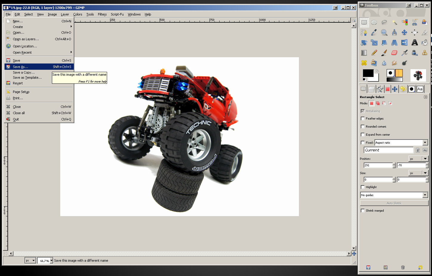
Click “File” in the main window’s menu.
There are two options here that we need: “Save” and “Save As”. Here’s the difference: as long as GIMP is running, it remembers what files have been opened with it and how were they saved. Therefore if you select “Save” for the image that was saved in the GIMP for the first time (or you saved it before, but you restarted GIMP after that), you will get exactly the same options you would get selecting “Save As” (including renaming the file). On the other hand, if the file has been saved with GIMP before, it will be saved using the same settings without giving you any options. Personally, I prefer to use “Save As” options at all times rather than to try to keep track of which files I already did save and which ones I didn’t. This way I can make sure it’s saved exactly with the options I want.
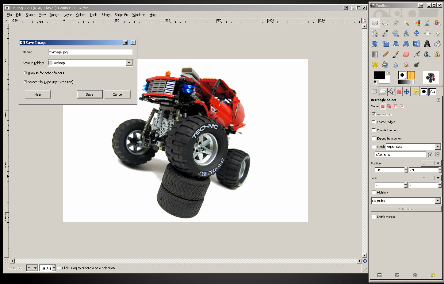
So, let’s select “Save As”. You’ll get the basic options window:
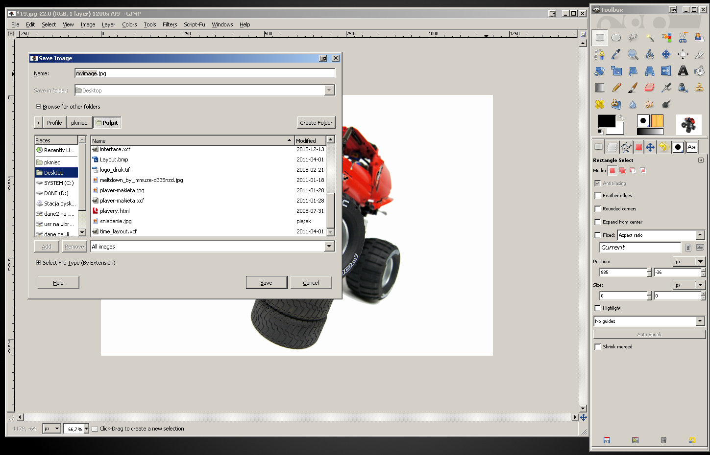
From here, you can change the file name and select a folder to save it in. If you click the “Browse for other folders” option, you will get some more options:
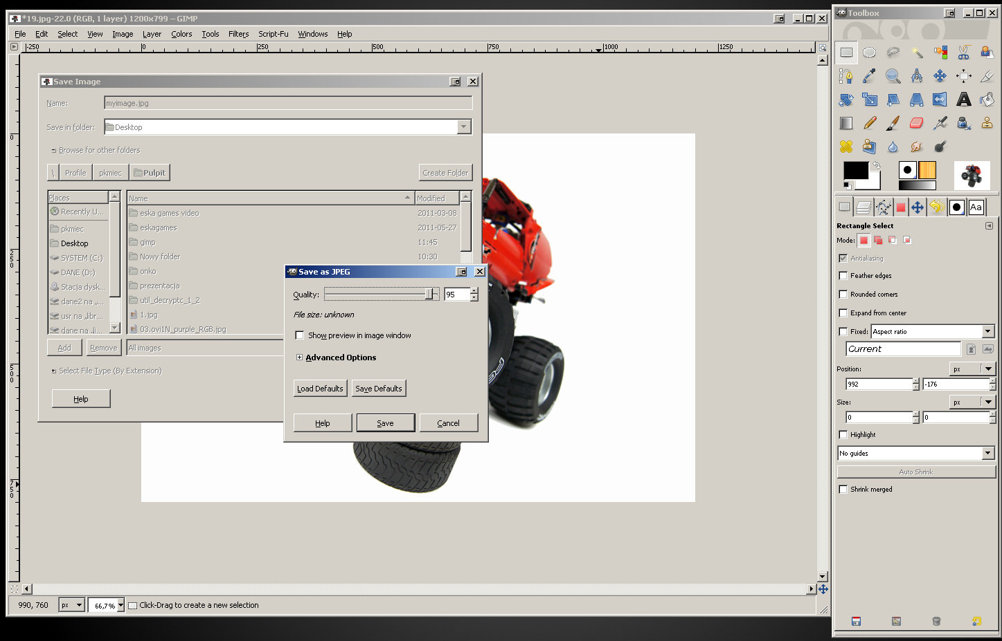
Once you’re happy with the name and location of our file, click “Save” and you will see the final options window that contains settings for saving in the JPG format:
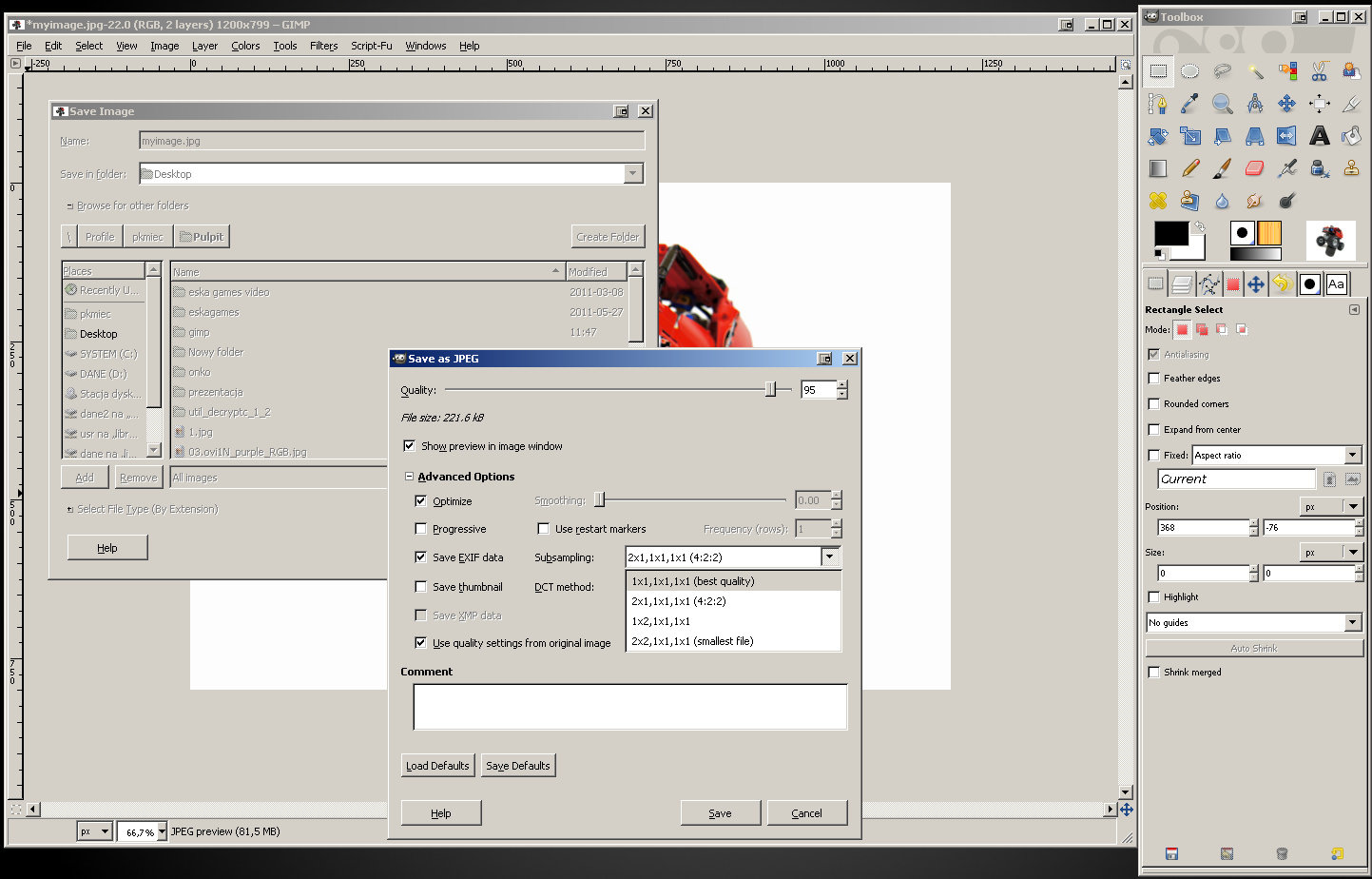
We, however, want more options. Check the “Show preview in image window” option and click the “Advanced options”. You will see the size (or, as we called it, weight) of the file saved with the current settings, and several other options. What we want to change is “Subsampling”. Make sure that this option is set to the first, “best quality” setting:
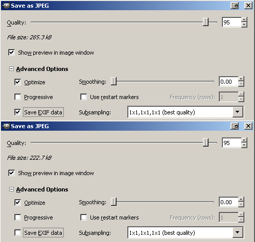
Also, make sure to uncheck the “Save EXIF data” option. EXIF data is a piece of data generated by your camera upon taking the photo – it describes what kind of camera the photo was taken with, and what were the specific settings of the camera at that moment. We don’t really need to keep this data in the photo, especially that it can significantly add to its weight. More advanced cameras have more various settings, and they store them all in your photo using EXIF data. Compare the difference in the file size with the “Save EXIF data” checked and unchecked for a photo taken with a DSLR camera:
As you see, unchecking this option made the photo over 40 kB “lighter” – it weighs over 16% less and its quality remains exactly the same.
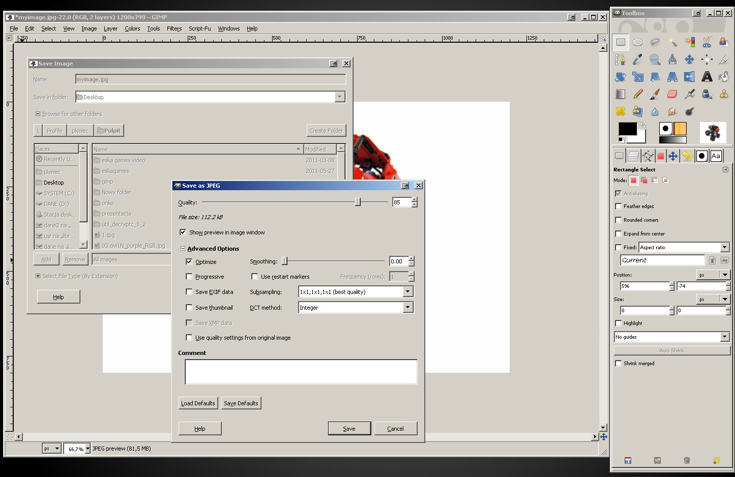
Finally, let’s adjust the “Quality” slider at the top of the window. You can experiment with it watching how your changes affect the weight of the file and the appearance of the photo (which is previewed with current quality setting). For photos with white background and juicy colors, it’s best to keep this setting at 85 or more. Going over 95, on the other hand, will be in most cases redundant and will not cause any noticeable improvements in quality. Personally, I usually stick to 85 for regular pictures and 90 for pictures that have some text on them.
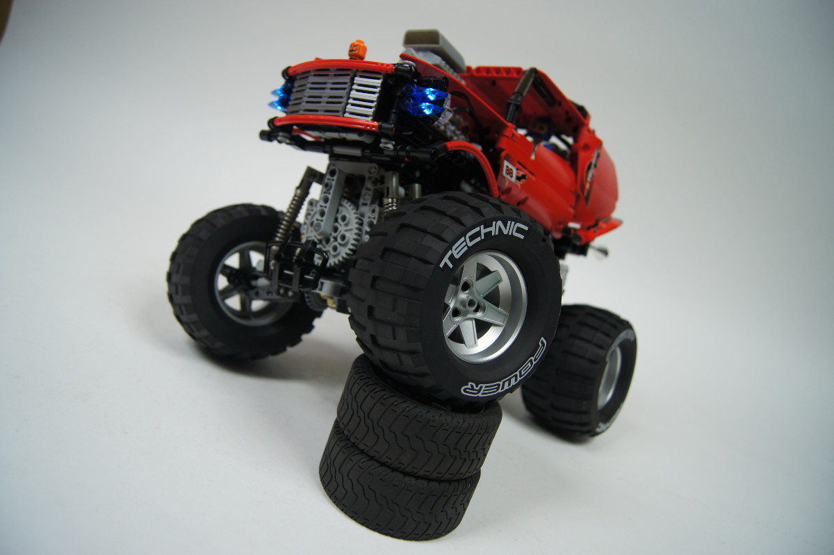
Congratulations, you just saved your photo! You can now close the GIMP and proudly show your picture for the world to see 🙂 Let’s see a comparison: here’s what my photo looked like at the start of this tutorial:
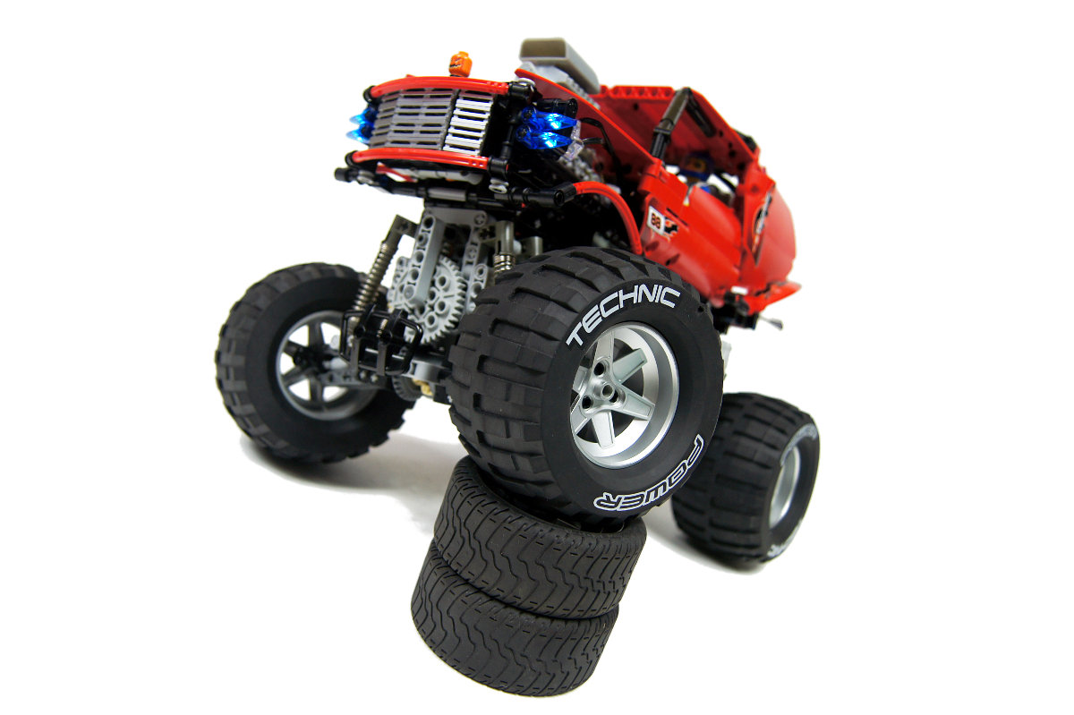
And here is what it looks like now:
Note that it doesn’t just look better – it also weighs less.
I hope this tutorial was helpful to you. Note that it only covers a fraction of what can be done with the GIMP.
Have fun processing your photos.







Much thanks for your tutorial!
I will use it in my future photos!
@Szbó Máté
It’s called Extreme.
@Sariel
Thanks the answer. I have a last question: Waht is the effect’s name in the Behind the scenes video? I think the “itnro”
@Szbó Máté
I don’t have a link, I bought it.
Hello Sariel! How can I get the PS14? Do you have a link? Thank you!
I use Apple iMovie. @Old Man Jenkins
Thank you so much for providing such a tutorial, Sariel. It is sure to help me a lot!
@Old Man Jenkins
Other than Windows Media Maker I can’t think of anything free.
Is there a free editing video studio you would recommend?
Hi Sariel,
You might want to add that the “save as” option no longer works in the current versions of GIMP, since all non-GIMP file format output has been moved to “export” instead.
Thanks for the tutorial, it’s very helpful.
cnob
@Bevel
To po prostu papier.
Dzięki wielkie za poradnik, przydał się 🙂
Mam specjalne tło do fot, ale tylko jedną żarówkę, więc musiałem się troche w gimpie pobawić.
Aparat pożyczony od dziadka, też nie najlepszy :/
Oto efekt: http://www.brickshelf.com/gallery/przemekrzos/MagnumRacingEdition/a0.jpg
Używasz jakiegoś specjalnego białego tła, czy jest to po prostu zwykły duży papier?
@Hugo
I don’t remember.
What is the font that you used the photo of the hamster?
@Sariel
You’re absolutely right here, back then when I used to do this the digital cameras created pictures that weren’t as large as nowadays, I didn’t think about that consequence. And on 1200 width the effect will indeed be much less than the smaller formats in the past. Another lesson learned 🙂
@Jeroen
You can do that first, obviously, and the quality should be technically a little better. You certainly have a point here. But from my experience, if you start with a photo shot at 14 megapixels and end with 1200px wide image, there’s little difference. Except that processing 14 megapixels version in any way takes ages, and the final gain in quality is so negligible that I really don’t think it’s worth the effort.
Loved this tutorial, I used to do similar things in the past (on different topics though: boardgames and their pieces) with Paint Shop Pro, and it’s good to see where similar options are in the Gimp.
I have one question though; in this tutorial you apply the resizing of the picture as one of the first steps, whereas I would expect that it’s best to first make all modifications to colors, shadows, etc. and after that’s completed resize the picture to the smaller format you would use on websites. I can understand editing the sharpness needs to be done after resizing, but I would expect Color manipulation and clearing the background going before resizing, can you explain why you do this early in the process?
@TheTechnicKiwi
I think it’s best to look for advice on some photography-related forums. I’m not expert on cameras and I don’t know any of the models you mentioned.
Hi. I don’t have a camera for still’s or video and I am eyeing up either the Canon PowerShot A2200 or the Fujifilm Finepix JV200 or something similar. do you have any suggestion’s on what to buy?
Very useful turorial , Thank you very much !
BTW: the Chinese Version http://www.lelezhen.com/showthread.php?t=14870
thanks out of germany!
@sqiddster
I suppose the natural sunlight is a very good solution, if you deal with the fact that it can be sharp and comes from one point only. I have little experience with outdoor photography, so I suggest you look for hints elsewhere.
Very nice tutorial. I wonder, for those of us who do not have the budget, if taking photos outside in the late afternoon sun is a good alternative to the studio lights. Also if one was to choose this option, what, if any, considerations need to be taken in regards to this tutorial.
@Jon Håvard
No.
http://artige.no/bilde/5924 Is it Lucius?
Thanks! It was really very helpful. You can check my photo at – http://www.facebook.com/robocasters .I haven’t used Fuzzy Tool in it.
@LB
Niestety, nie mam na to czasu.
Witam.
Mam małe pytanie. Czy mógł byś zrobić poradnik w wersji PL, lub film na YT?
@Mecho12345
Here: http://lmgtfy.com/?q=free+fonts
And welcome to the Internet.
Wow cool tut. but I have one question: how do you get all the cool fonts on all of your main pictures, as far as I know OS X, windows and Linux don’t have them
@freakybuilders
You can achieve the same effects with the Photoshop, but in a different way. The GIMP and the Photoshop are two different pieces of software.
Does it also work with Photoshop CS5.1 Extended??
Nie moge sie doczekac az twoj BMR-2 bedzie gotowy 🙂 widzialem go na zdjeciach u gory 🙂
@Sariel
I would’ve laughed if you had answered from experience: BRICKLINK!!!! 😀
@Daniel
At paper shop.
Where did you get the paper roll??
@Vladimir
I’m using Pinnacle Studio 14, there are dozens of tutorials for it.
Great tutorial. Thanks a lot!
It would be nice if you can make a tutorial about the software you are using for making videos and editing. Keep up the good work, your models inspired me to buy few Technics sets and start with Lego again after 20 years 🙂
Great tutorial!
One thing: your lighting setup is quite professional looking, and kinda expensive. Since I don’t really have a budget (being 14) I do the thing you do with paper, but I have a single white lamp. I change my shutter time to about 10 – 15 seconds, and then, while my camera’s taking the photo, I move the light around. That also gives a pretty decent looking white background :).
But thanks A LOT for the processing tutorial! I used to just increase the contrast to get a perfect white background; that messed my colors up though. This is MUCH better!
– Leon (aka dimastero)
Wow thanks for the tutorial!! It really helped me produce way better looking photos!
tim
@David Luders
Hamster nightmares? Like, you’re in your bed, on the verge of falling asleep, and you think you feel something small and furry brush your leg? 😉
Yes, it is very usefull. Good photo is a good communication. I have tried to make good photos but without white back, it is quite hard to acheive. But I take care about color, saturation and EV. That is a begining ! I wish I had a proffessional equipment like you !
This tutorial is very useful! Your helpful tips will help raise the level of Lego photographs published on the ‘net. I may have nightmares about that “Killer Hamster”, though…. 🙂
Excellent and helpful tutorial, Paul!
Usually my problem is really the lighting and the camera… If they are too bad like they are, usually there not much left to do with Photoshop.
But I still try… sometimes. 🙂